Pictures and ideas that have inspired me
These photos was taken by Chris Peterson as part of a project where he spent '100 Straight Days in Glacier National Park'. The pictures are a project where he spent 100 days photographing Glacier National Park, using a variety of cameras that span the last 100 years. The photos were displayed in the Hockday Museum of Art in 2010, and were also included in he special collector's magazine.
|
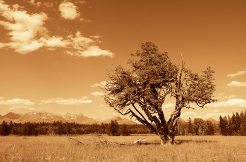
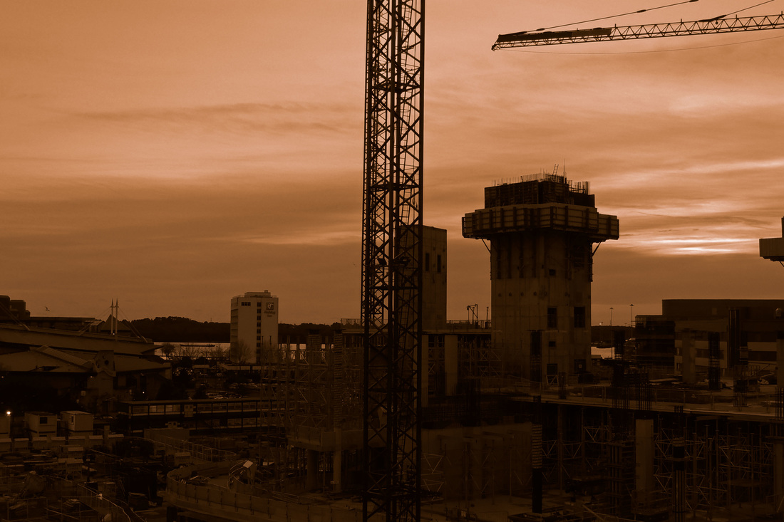
This picture was taken with a sepia filter on a Nikon Digital camera. Real sepia toned prints are made using ferrous cyanide, they involve adding dye to a black and white photograph. I like the look of the sepia affect and like how it ties in the old with the new, so I think I will ues this in my final edits that I create.
|
|
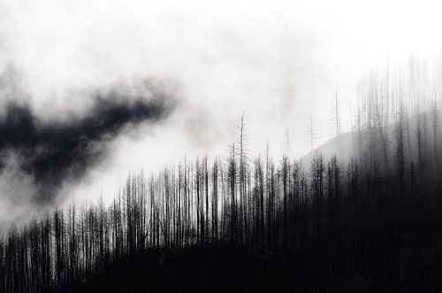
This is a picture of fog hanging over the Apgar hills. I love the shades of black and white in this picture and will consider using photoshop to achive a similar affect in the photos I take. |
|
These photos were taken by Sandi Kalifadani, who takes photos as a hobby. He predoninantly uese analog cameras. These pictures were taken using expired red scale film, the fact that they are expired means that they have a very vivid red and the result is more unpredictable, which makes for a gorgous colour and mood for the pictures.
Sandi Kalifadani is a passionate hobbyist who likes to experiment with analog cameras, expired flims, and uses different techniques to add interesting affects to his pictures. He likes to bring cameras with him wherever he goes in order to capture interesting images, and he develops the films himself.
Sandi Kalifadani is a passionate hobbyist who likes to experiment with analog cameras, expired flims, and uses different techniques to add interesting affects to his pictures. He likes to bring cameras with him wherever he goes in order to capture interesting images, and he develops the films himself.
Initial Photos
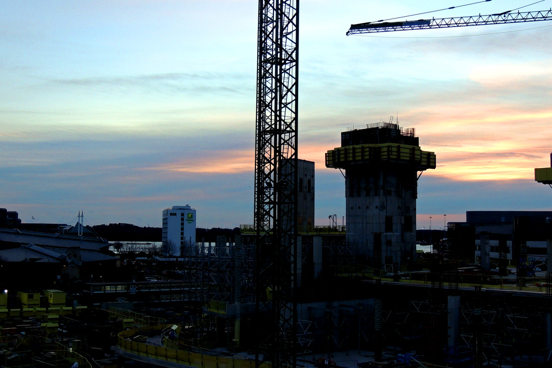
I have decided to use Paul Gonella's photography as the inspiration for my final pieces, I love the different view points he uses and the different angles because they create interesting shapes. I took my pictures in the evening because I like the colour of the light and the shades of orange and pink in the sky, I also like the look of the cranes silhouetted against the sunset and that you can see the Christmas lights glowing in the darkness. I attempted to take my photos from different and engaging perspectives so that my pictures would be exiting and effective. I have decided to incorporate the comparison between old and new in my final edits by editing these pictures to look as if they were taken on an analogue camera using different techniques that those cameras use, such as sepia, black and white and red scale.


Edited photos


|
This picture of the docks was taken while the setting sun turned the sky yellow and orange. I love the contrast between the very urban construction site, with cranes and lots of detail where you can see different bits of equipment and the indistinct wash of the clouds in the sky, a juxtaposition between nature and man made objects. The fact that I took it from a high vantage point allowed me to get a better view and get a picture of the whole scene.
|
|
|
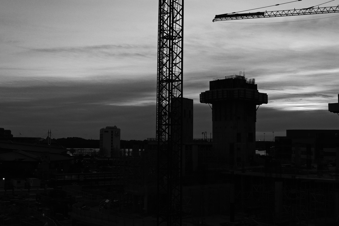
I created this edit by putting the image in grey scale, so as to imitate the look of black and white film. I used curves to change the contrast between the dark and light shades to give the picture more depth. However, in retrospect, I think I wouldn't have made the foreground so dark as it is hard to see the details in the picture.
|
|
I used the duotone mode on Photoshop in order to make my picture appear like a sepia image. I then used curves to change the contrast, which I am happier with in this picture because you can see all the details in the foreground. I also like the colours because they are affective and look fairly authentic. It makes you feel as if you are seeing Southampton as it was in the past.
|
|
|
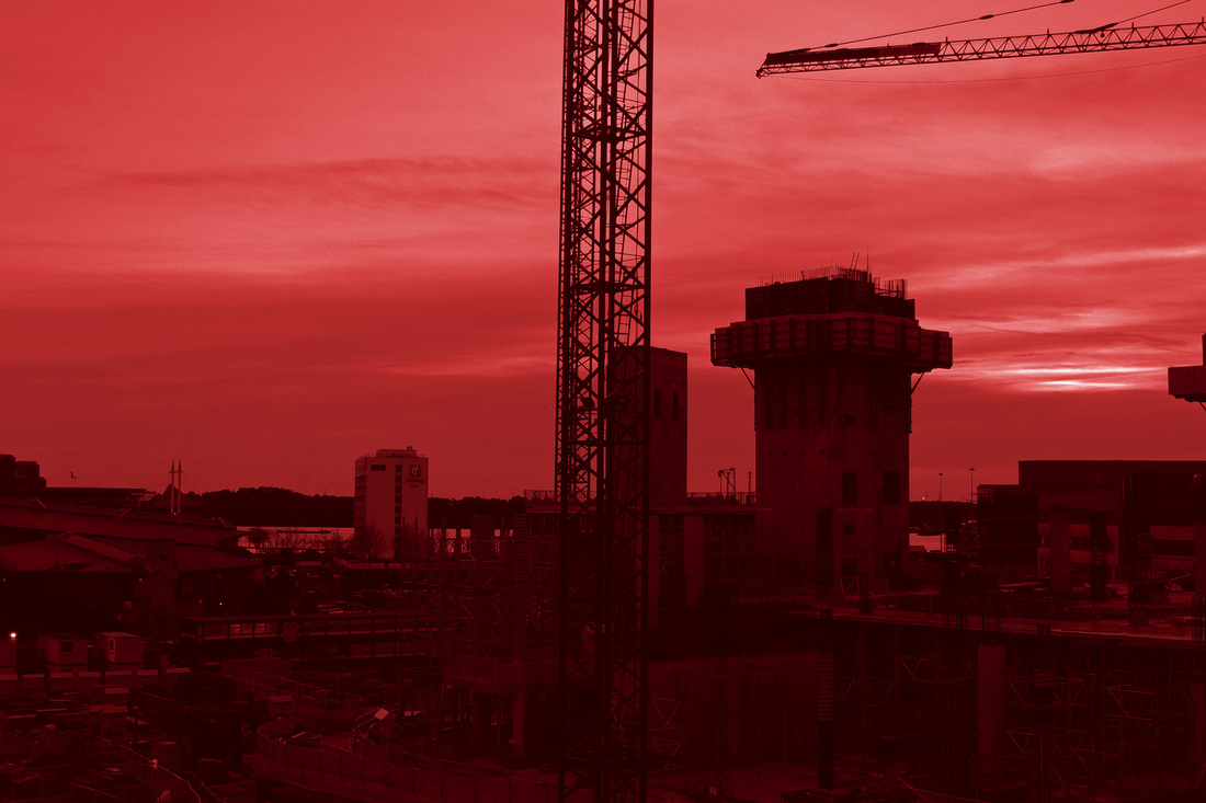
This picture I also used the duotone mode, however, instead of using black and orange I used a very dark red and a lighter red to achieve this red scale look. I also turned the saturation up because I like the brightness of Sandi Kalifadani's photos. I think this is the most effective red scale picture I have created; I like that this makes the picture look as if it is bleeding.
|
|
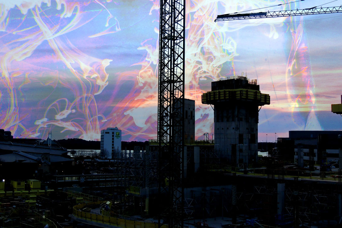
I used another ink edit for this picture, however, this time I used the same technique, of changing the opacity and deleting the areas I didn't want, to layer the swirling pink and blue ink onto the sky. I thought this made it look as if smoke was rising from the construction site, adding to the urban feel, while not detracting from the contrast between the sky and the buildings
|
|
The edits I created from the pictures I took represent something akin to a visual journey through time. Starting with black and white monochrome images, progressing to duotone images and then through to experimental analogue photography and experimental digital photography. You see the way these different things change the objects you are looking at and how people have developed different and interesting ways of capturing images to get the effect they want. If I were to change something about the project I did, I would have taken the pictures using an actual analogue camera, however, this was impractical - especially for the sepia images which require careful development in a dark room with harsh chemicals. However, I think that these edits are not the best work that I could produce, there for I have decided to seek different inspiration and try out a more practical approach by using a physical editing process, rather than just Photoshop.
More inspiration
Alberto Seveso
Alberto Seveso is a freelance Italian illustrator and photographer. His facination with graphic art began at a young age and was facinated by the graphics of skate decks and the cover art on metal CD's in the early 90's. Some of these photos were created by dropping fluo arcrylic paint into oil, which creates a very different affect to simply dropping paint or ink into water, because the two substanses cannot mix it makes it look shiny and more solid. The inks create beautiful, detailed, swirling patterns and I used these as my main inspirations for my background pictures. http://www.burdu976.com/phs/.
Initial background responses to Alberto Seveso
I created these pictures by dropping black ink into water and attempting to capture the patterns this created. When I used the flash on my camera it gave the ink a red hue, which I rather liked. I also liked the reflections created by light refracting through the water and onto the paper behind.


Edited background responses
I created these by using the hue and saturation tools on photoshop, this meant I was able to change the colour of the background and the ink to make it surreal and more abstract. on the first two pictures I inverted the colours, meaning that the ink appears white and creates a wonderful effect that I really like.


Final peice experiments
I created these two sellotape edits so I could decide whether to use this technique for my final pieces. I really love the effect these images have, you can just pick out what they are of, however they have a dreamlike element to them because of the ink edits, which have been used as the background.
Sellotape prints are created by covering an image in sellotape and then submerging that image in warm water for about 15 to 20 minutes. When the paper begins to peal off of the sellotape then the paper is rubbed off the selotape; the image is stuck down on a background. These images are fun to create as there is so many different things you can do with them. I plan to not only use these ink images as my background images, but also create backgrounds using water colour paints and collage using brown paper. I like the use of brown paper in the background of these sellotape prints as it gives parts of the picture an almost sepia appearance and plays with your perception of the image.
Sellotape prints are created by covering an image in sellotape and then submerging that image in warm water for about 15 to 20 minutes. When the paper begins to peal off of the sellotape then the paper is rubbed off the selotape; the image is stuck down on a background. These images are fun to create as there is so many different things you can do with them. I plan to not only use these ink images as my background images, but also create backgrounds using water colour paints and collage using brown paper. I like the use of brown paper in the background of these sellotape prints as it gives parts of the picture an almost sepia appearance and plays with your perception of the image.
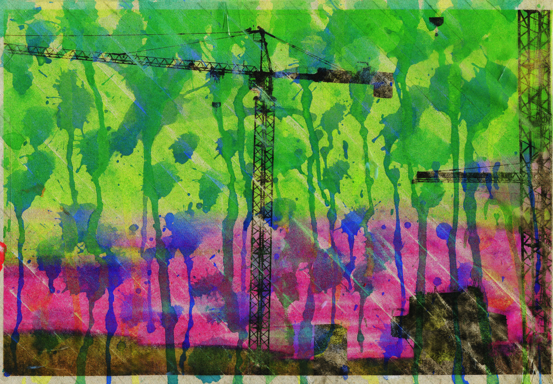
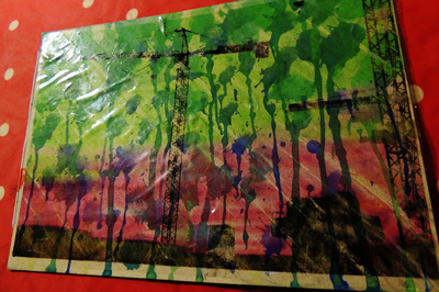
I created some more sellotape edits, however this time I decided to change certain aspects of them to create a different affect. I used watercolour paints to make interesting backgrounds for my images by dripping them down the page. For one of the pictures I used reds and oranges and a hint of blue to match the sunset in the picture. In the second picture I used greens and blues and a more of a splattering technique, rather than dripping
|
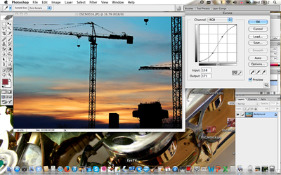
I used curves to increase the contrast in the picture, I wanted to make the colours brighter so the resultant picture was vibrant enough to stand out against the background.
|
|
|
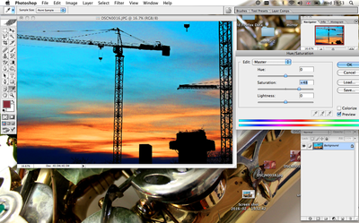
I then increased the saturation using the hue and saturation tool to make the picture brighter to make it bright enough to provide a good contrast to the background. I doesn't need to have very subtle shades in the clouds because the end result doesn't have very much detail in the clouds.
|
|
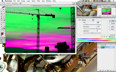
I then changed the colours of the picture using the hue and saturation tool to make it suit the colours of the background I had created, I thought the pink would contrast nicely to the greens and blues in the background.
|
|
|
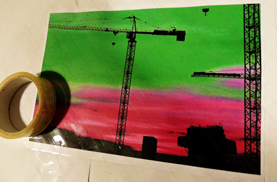
I then covered the picture in sellotape, overlapping the strips to make sure the sheet does not come apart when the paper peels off.
|
|
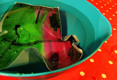
I then put the picture in warm water for about 15 minutes until the water had soaked in enough to be peeled off. When I peeled the paper off the back the ink from the picture stays stuck to the tape, creating a translucent image which, when it is dried out, you can stick down on the background you have created.
|
|
|
I then dried out the sellotape picture and stuck it down on the background I have created. I think the end result is very effective, it has a different look to the first sellotape edits I created as you can see the picture more clearly and the colour of the image works with the background, which is why I used a colour image and not a black and white image like I did for the first two edits.
|
Final Pieces
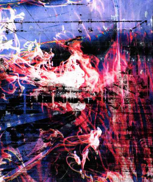
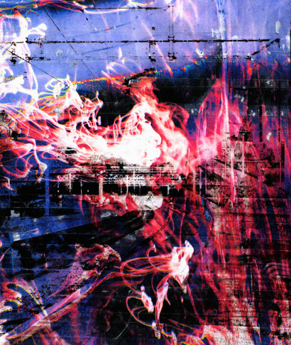
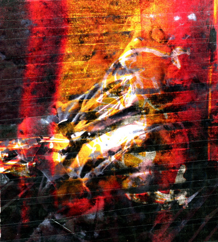
I chose this piece as one of my final pieces as the colours are bright and vibrant and there are interesting shapes created by the swirling of the ink and the straight lines of the station platform. The contrast between the gritty urban platform, the straight lines of the overhead wires and the flowing background, the curves of the ink drops, creates a surreal affect and emphasises these qualities in the picture. I like that you have to look closely to pick out the details in the station as they are not immediately obvious; your eyes want to focus on the bright pink and white ink, but you have to look closer to see the detail of the picture.
I used Photoshop to inverse the colours of the ink background, I liked the colours this created and also love the way it makes the ink look white and gives the photo interesting highlights, which fade nicely into the pink. These colours give the picture a calm feel, which goes hand n hand with the image of ink dropping into water, something that is usually used as something calming. This also suits the image of the train tracks, which can be used to represent a journey, in much the same way a road does.
I used Photoshop to inverse the colours of the ink background, I liked the colours this created and also love the way it makes the ink look white and gives the photo interesting highlights, which fade nicely into the pink. These colours give the picture a calm feel, which goes hand n hand with the image of ink dropping into water, something that is usually used as something calming. This also suits the image of the train tracks, which can be used to represent a journey, in much the same way a road does.

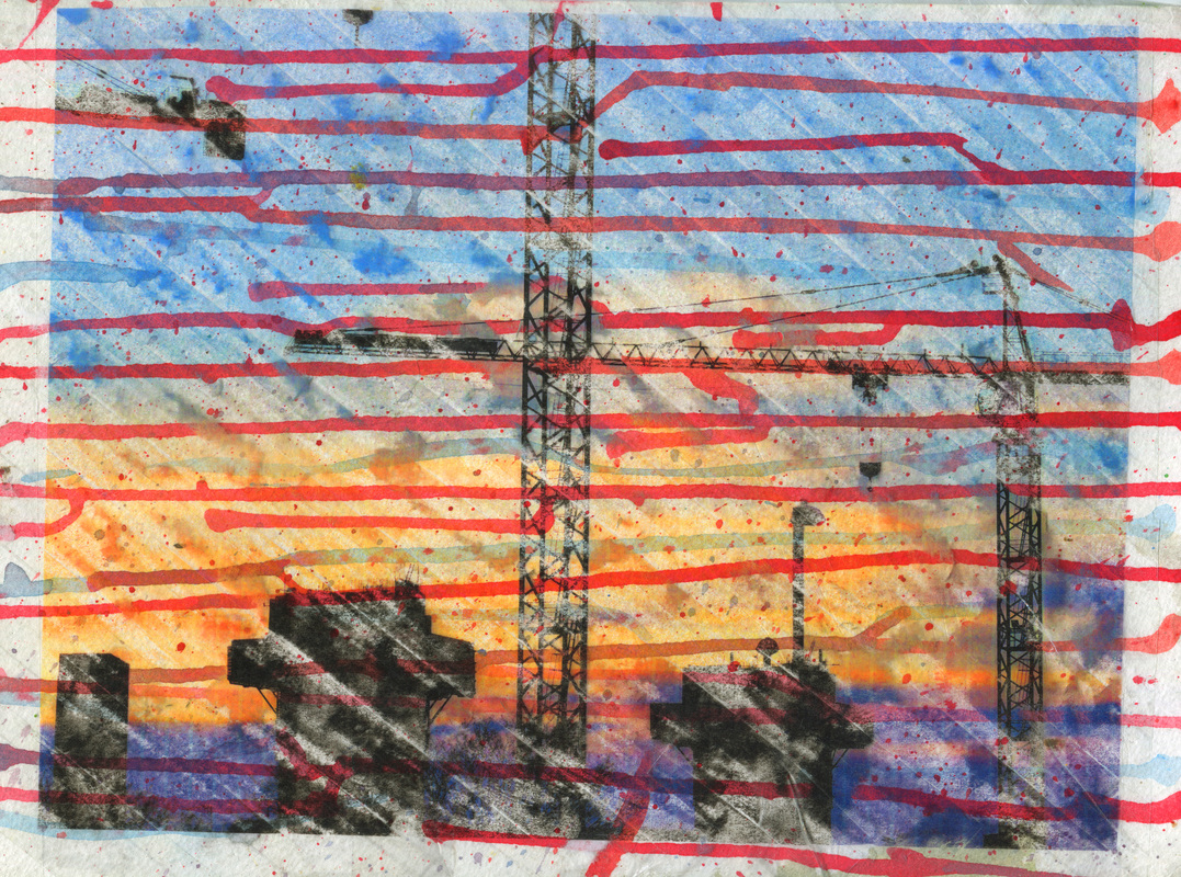
I picked this as one of my final pieces because I like the colours of the background I created and how these are complimented by the vibrant colours of the sunset. I created this background by dripping paint down a piece of paper, and I picked the colours specifically to compliment the colours of the sunset; reds and oranges with a hint of blue. I also used the paintbrush to flick spots of paint at the paper, which breaks up the lines of the paint dripped down the page. The black silhouettes of the construction site against the colourful background provide a nice contrast to the bright and vibrant hues of the rest of the picture, they help to make the picture feel complete and give you something to focus on; they give what you are seeing a context. I like the level of detail that has been preserved in the outline of the silhouettes, for example the ladder you can see on top of one of the towers, but that it still looks sketchy and indistinct because they are slightly translucent.
