Rankin Portrait Photography
John Rankin is a portrait and fashion photographer. He made his name founding the magazine 'Dazed and Confused', the magazine provided a starting point for emerging designers, stylists and photographers. Rankin is known for photographing people like Adel and Madonna and Lindsey Lohan and also his fashion photography. He uses makeup and props to bring out the personality of his subjects, he has built up a huge amount of work over the years in varying styles. The work he produces is surreal, using people as a human canvas to paint his pictures, seeking to bring what is on the inside of someone to the surface.
He uses a wide range of techniques to bring out his subject's personality, from lighting to extravagant face paint. To produce similar work to the photographer I plan to set up my own photo-shoot and experiment with lighting and makeup. I also plan to use props to give my pictures more interest and character.
My responses to Rankin


|
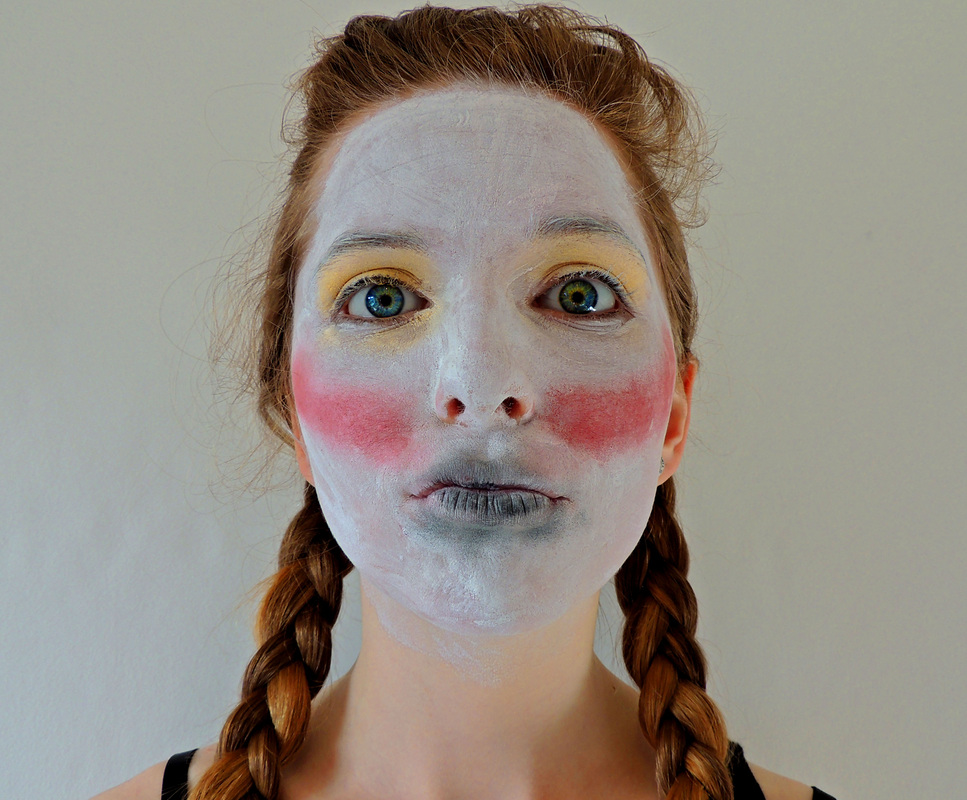
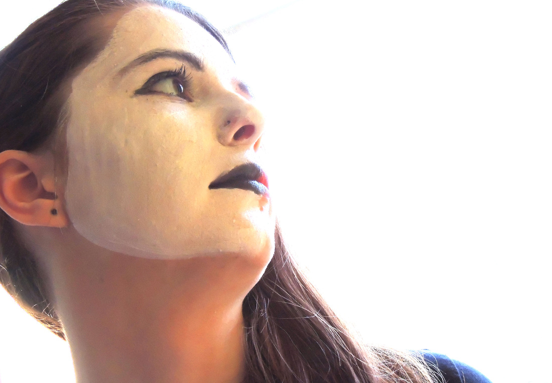
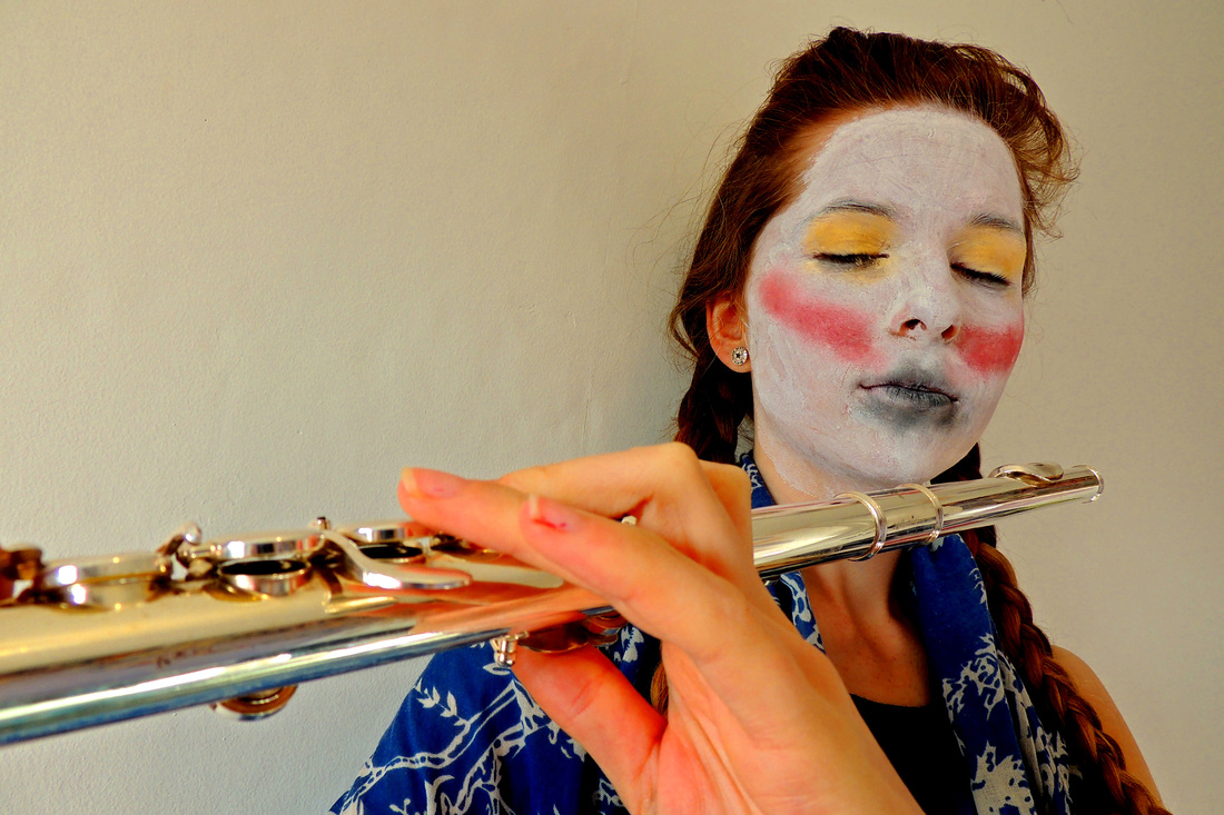
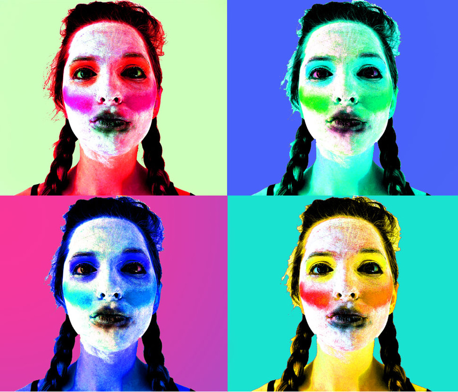
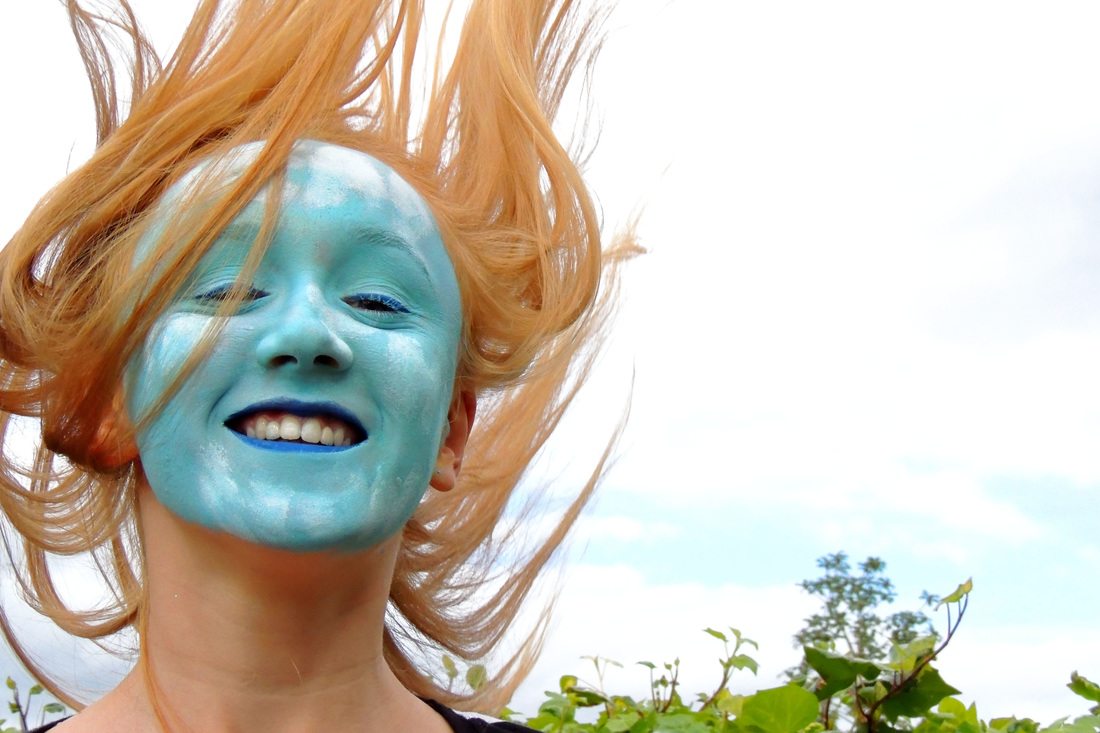
I like the simplicity of this picture, the symmetry of the face being right in the middle of the picture creates a nice affect. I also like the affect of the whiteness of the face and the whiteness of the wall, with a splash of colour from her hair and the makeup. |

|
|
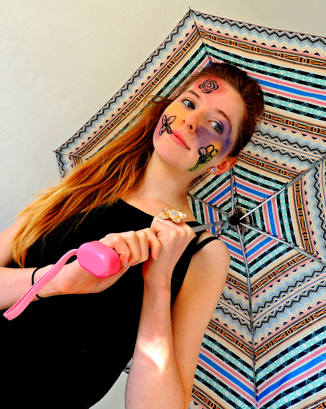
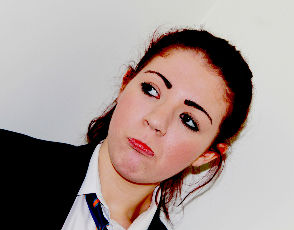
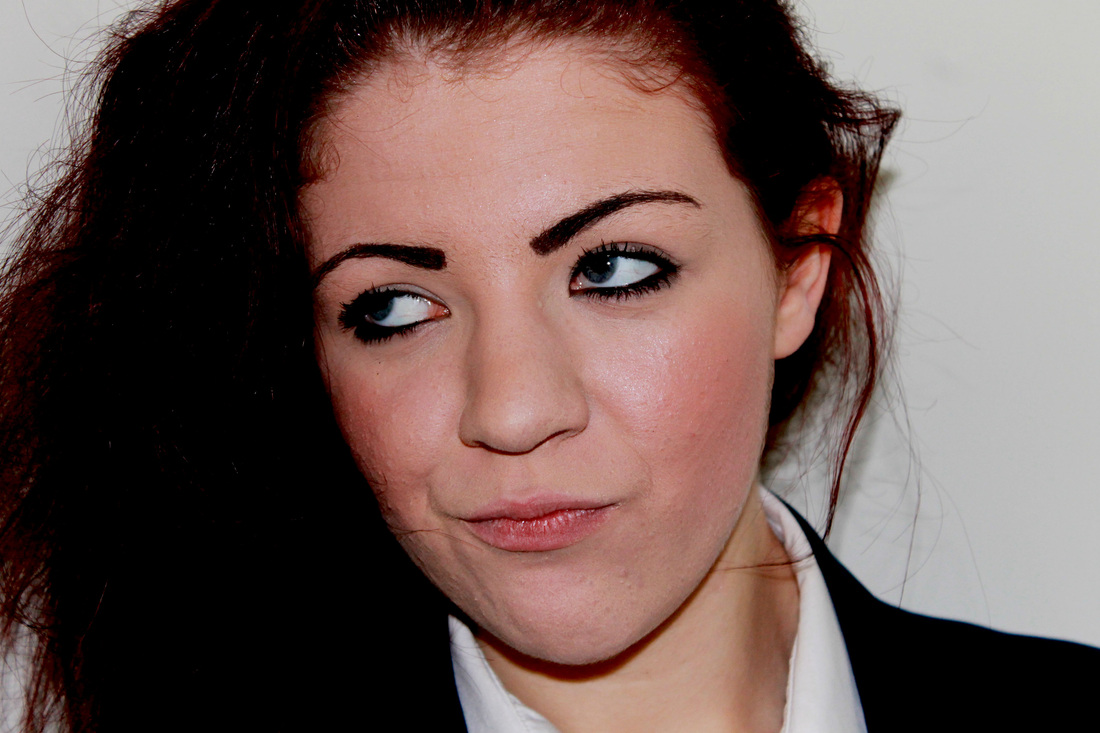
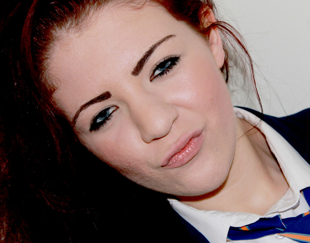
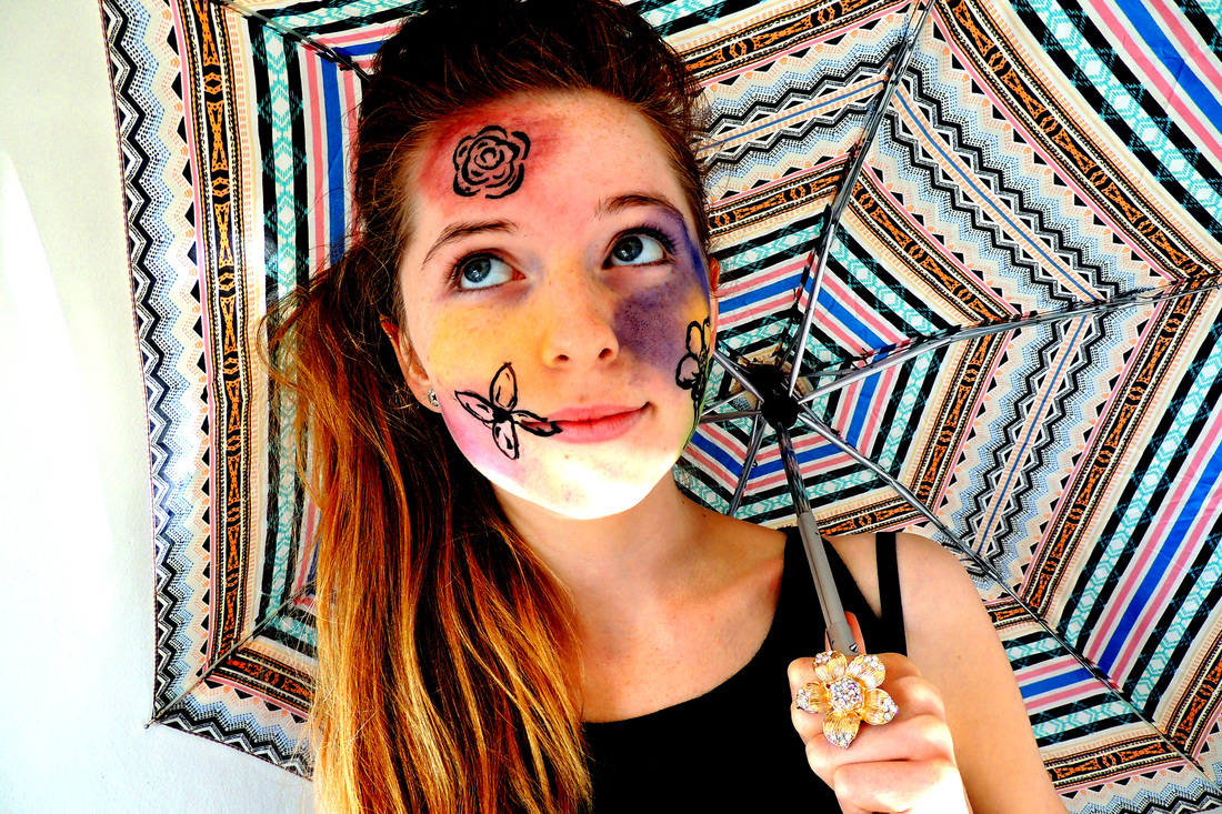
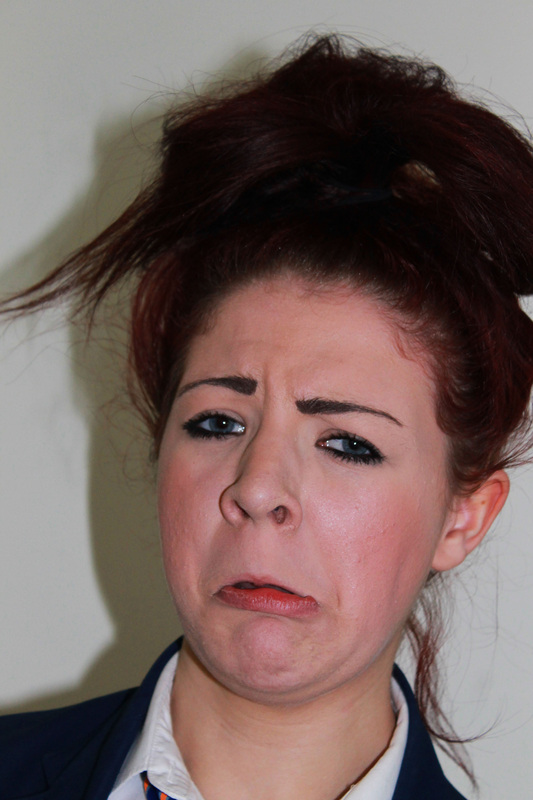
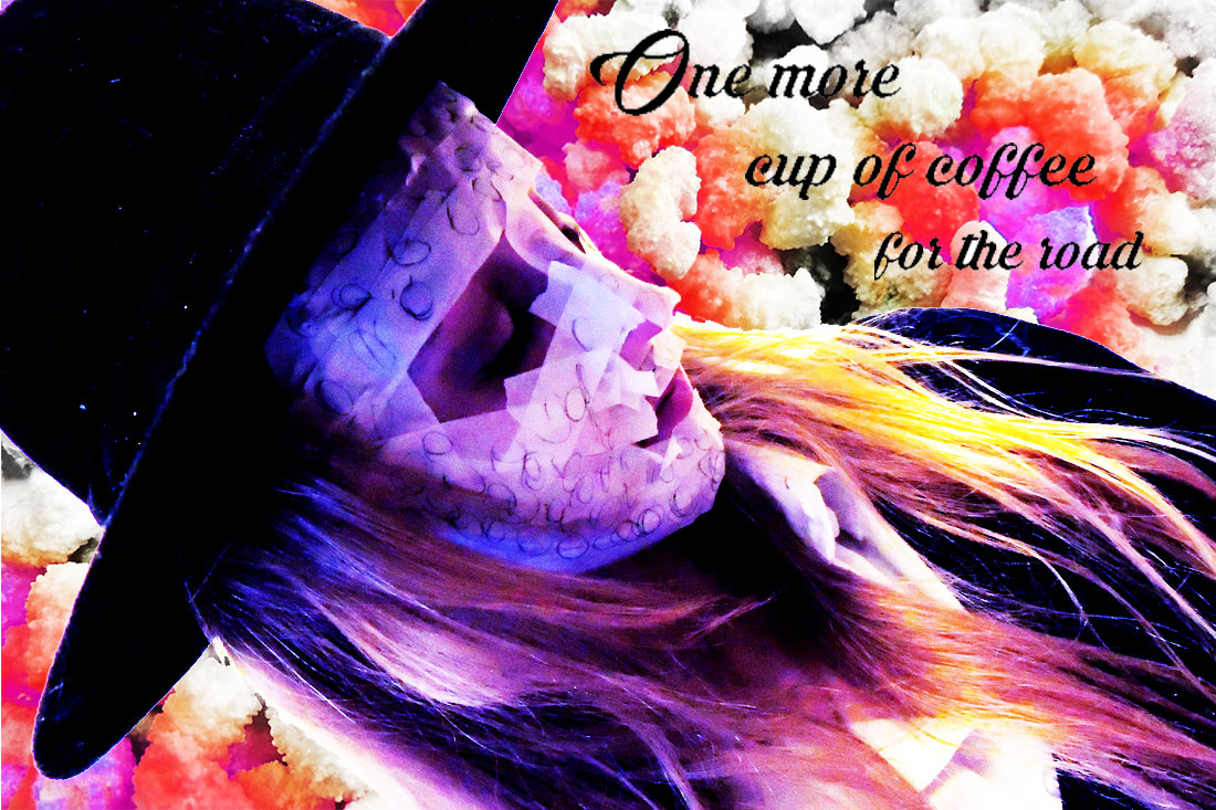
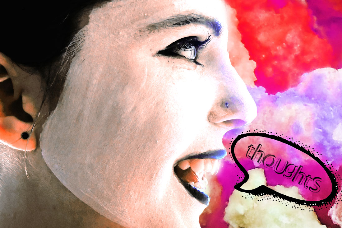
I like this picture because it looks almost as if she was playing and was then distracted by a thought. It's affective because it looks very stylized and posed. I used a prop to add interest to the picture and vary the content of my pictures. I used photoshop to adjust the colours in order to get the effect I was looking for. |
|
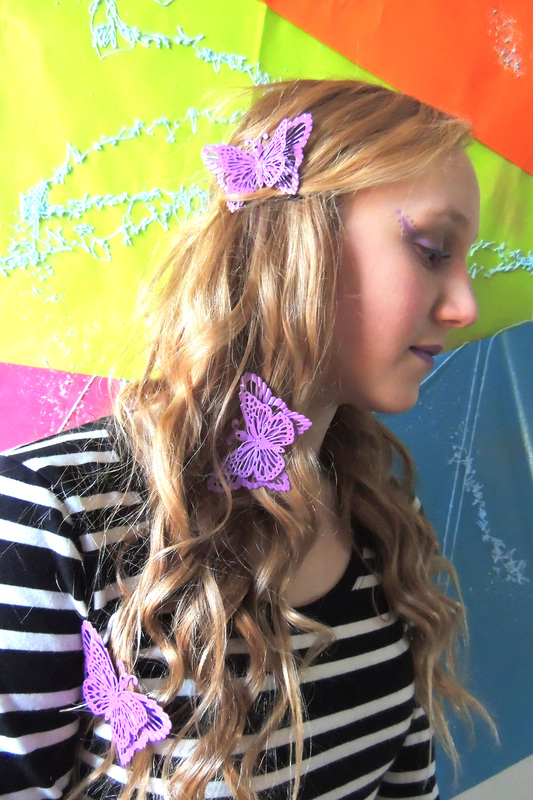
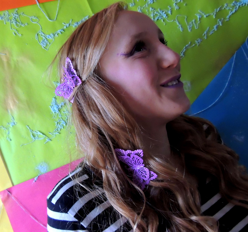
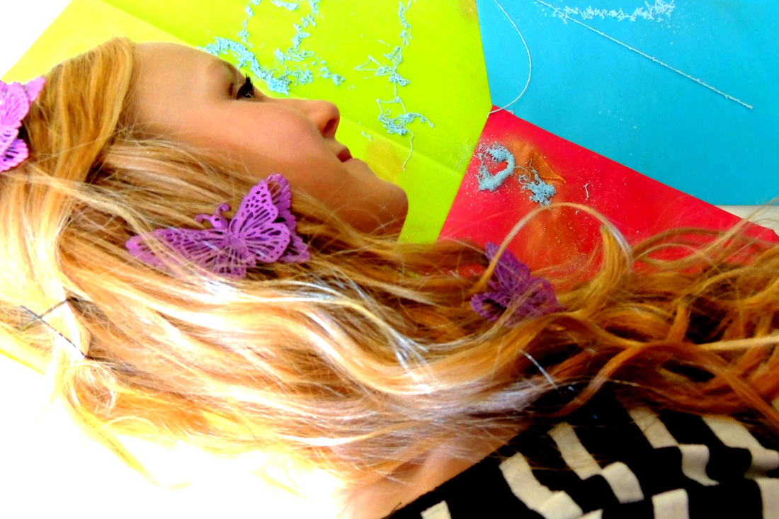
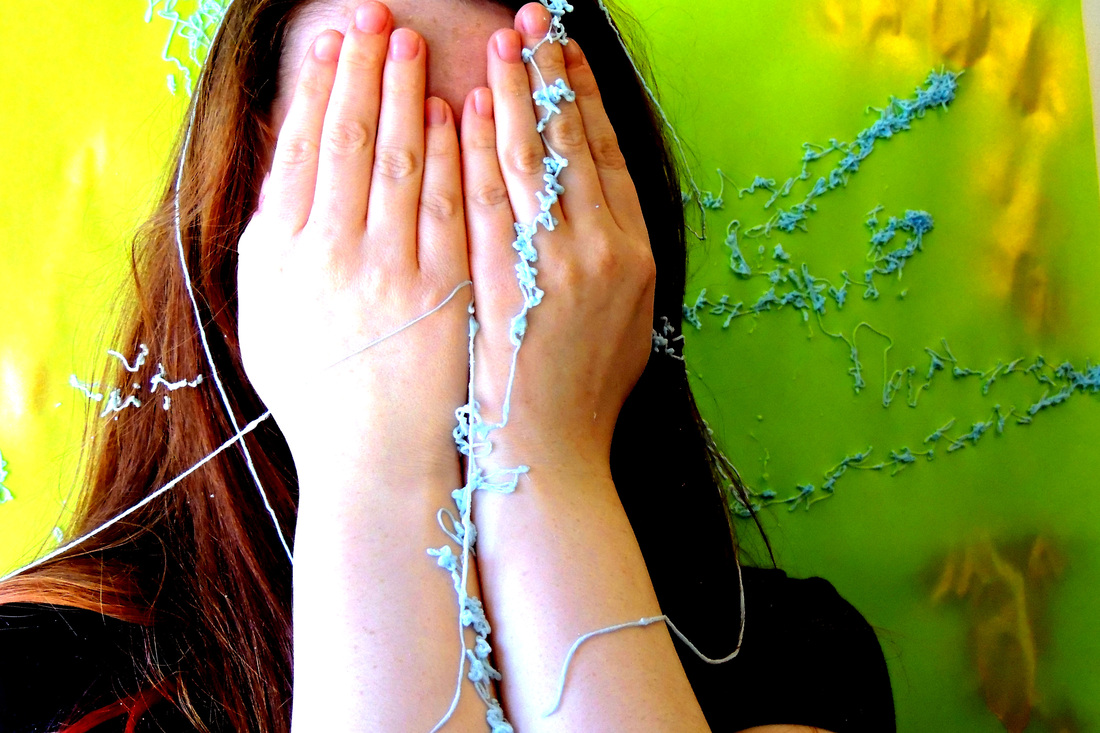
Most of the pictures I have taken show people's faces, apart from this one. I liked the idea of making it look like she was hiding from something. The silly-string on her hands makes the picture more whole, rather than there just being a colourful background with someone stood in front of it.
|
|

|
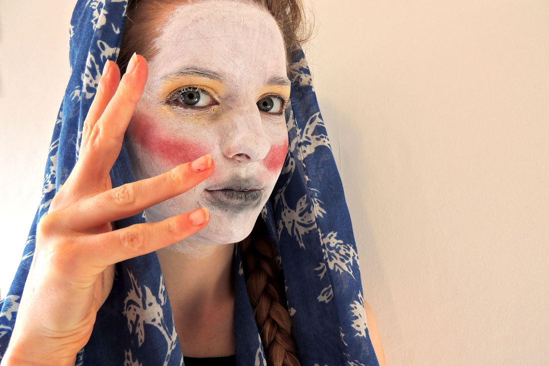
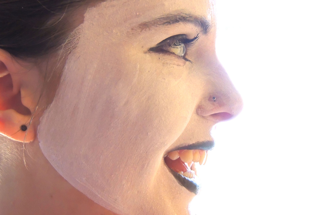
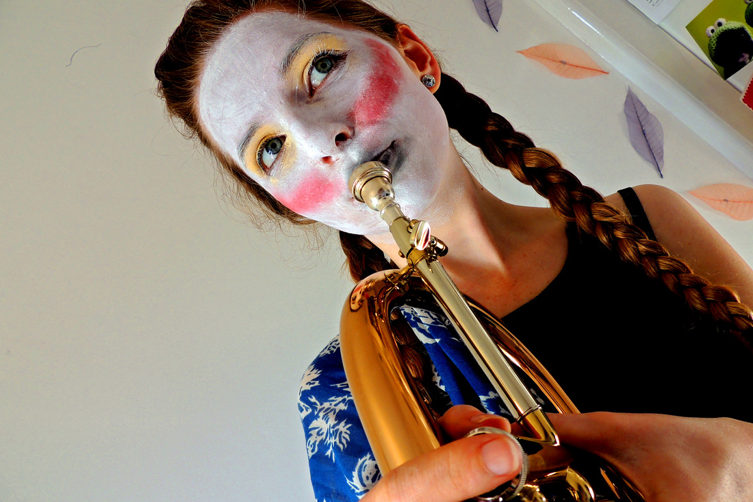
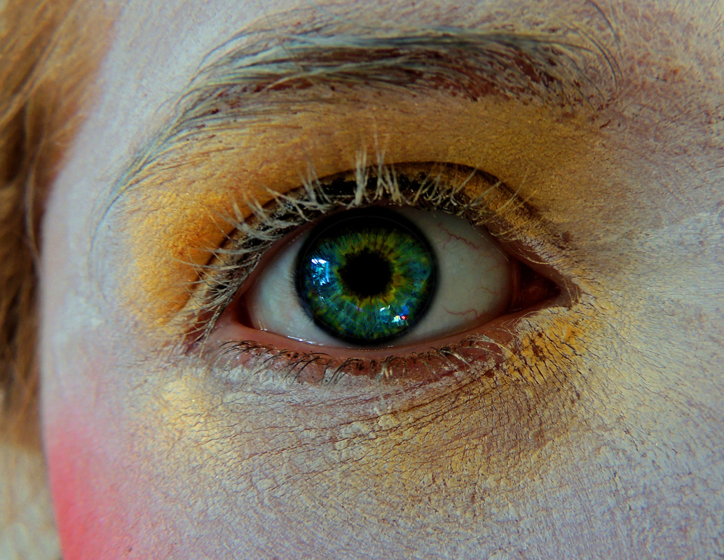
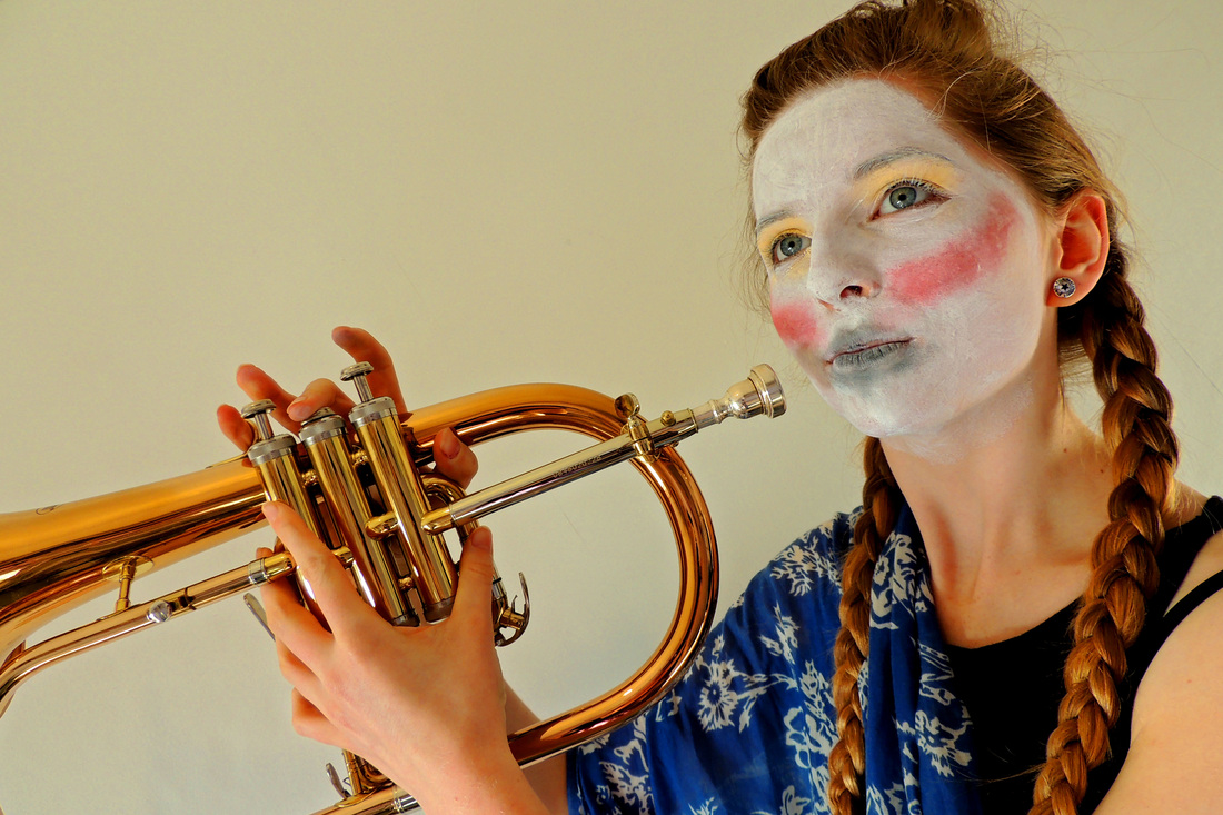
To get the affect of the light accross her face I used the lid of the makeup box, the plastic reflected light onto the wall and I thought it would look really good as part of the photo, so I angled it so the reflection fell across her face.
|
|
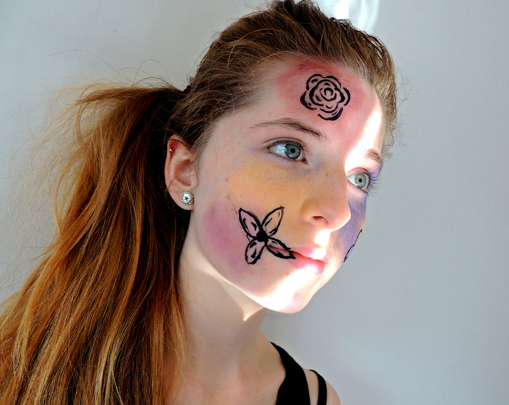
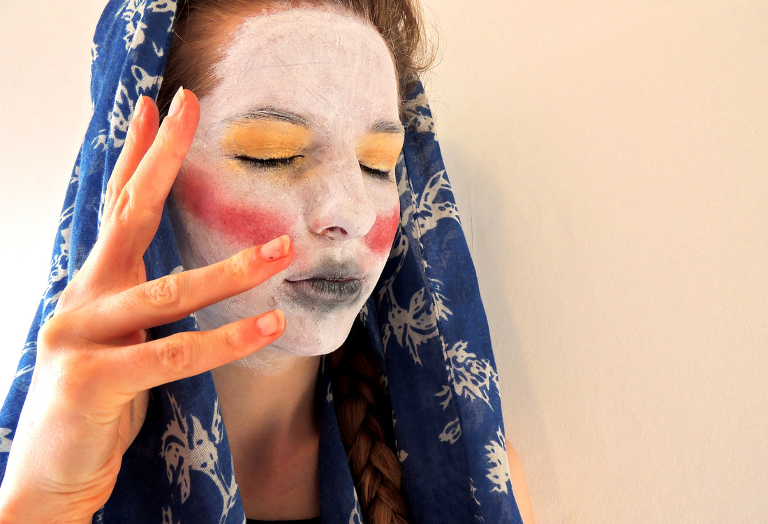
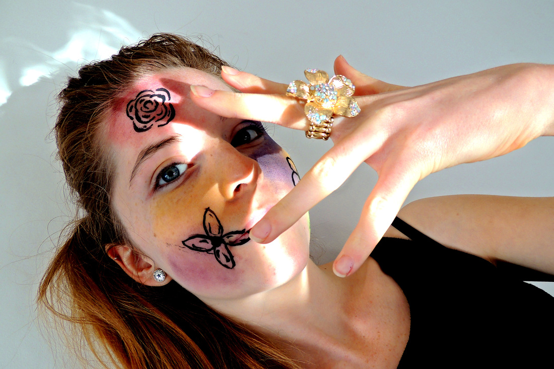
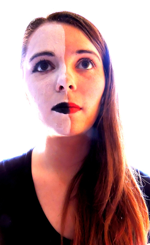
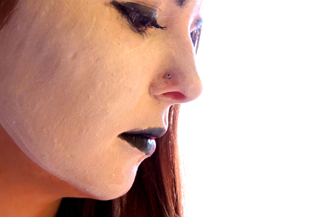
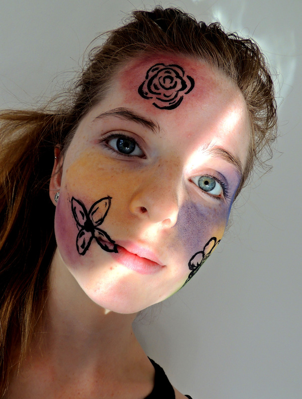
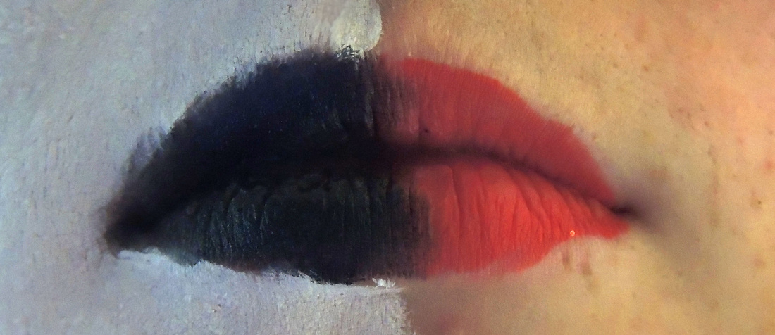
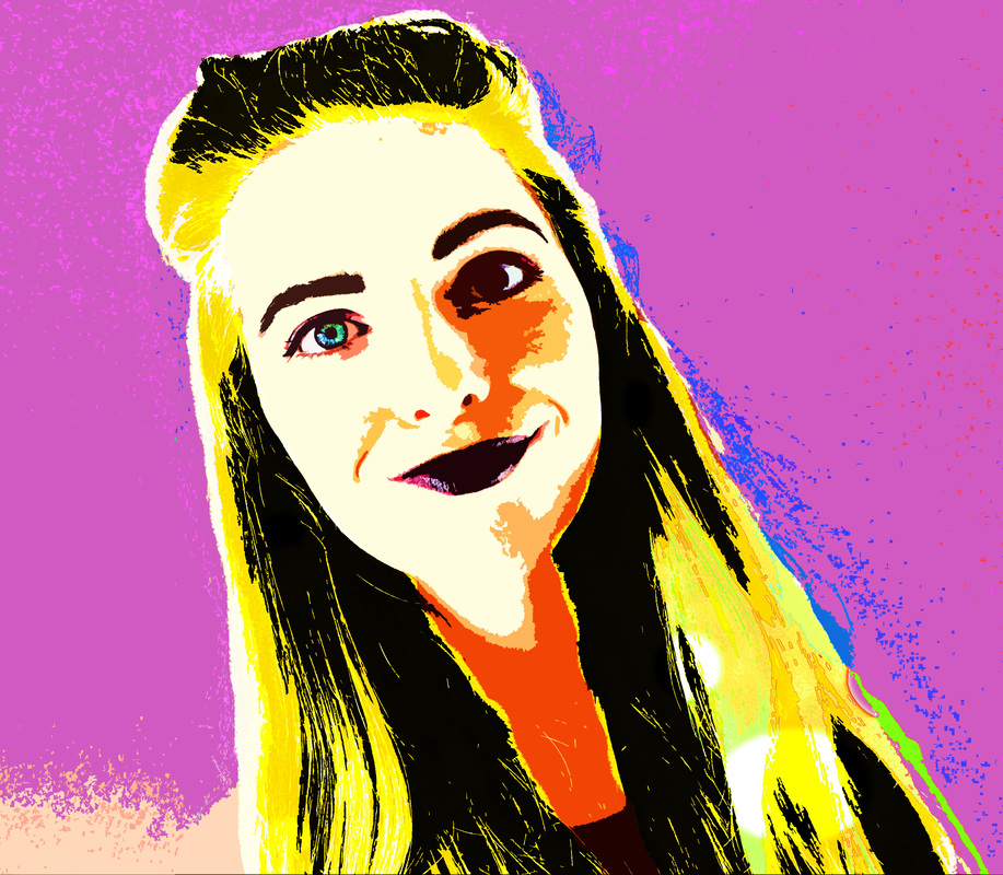
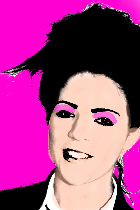
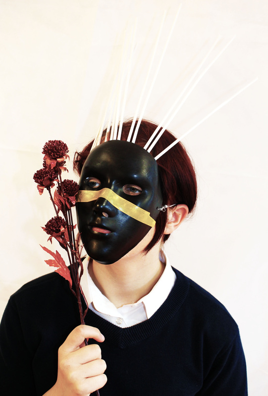
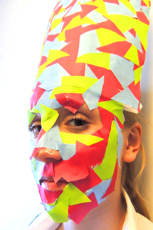
This picture was inspired by one of Rankin's photos where he has painted one side of a person's face black and the other half white, however for mine I decided to paint one half black and white and do the other half with more conventional colours of makeup. I like the effect it has one the picture, that one half looks moody and dark and the other half is in complete contrast with that. |
|

|
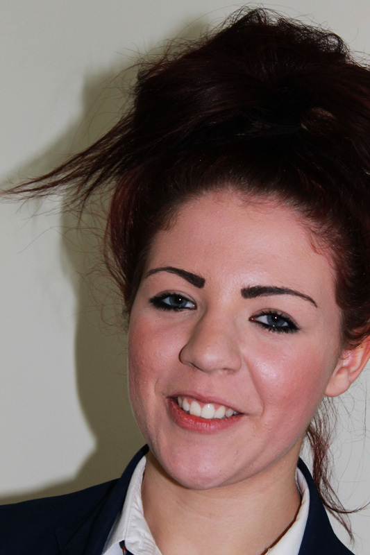
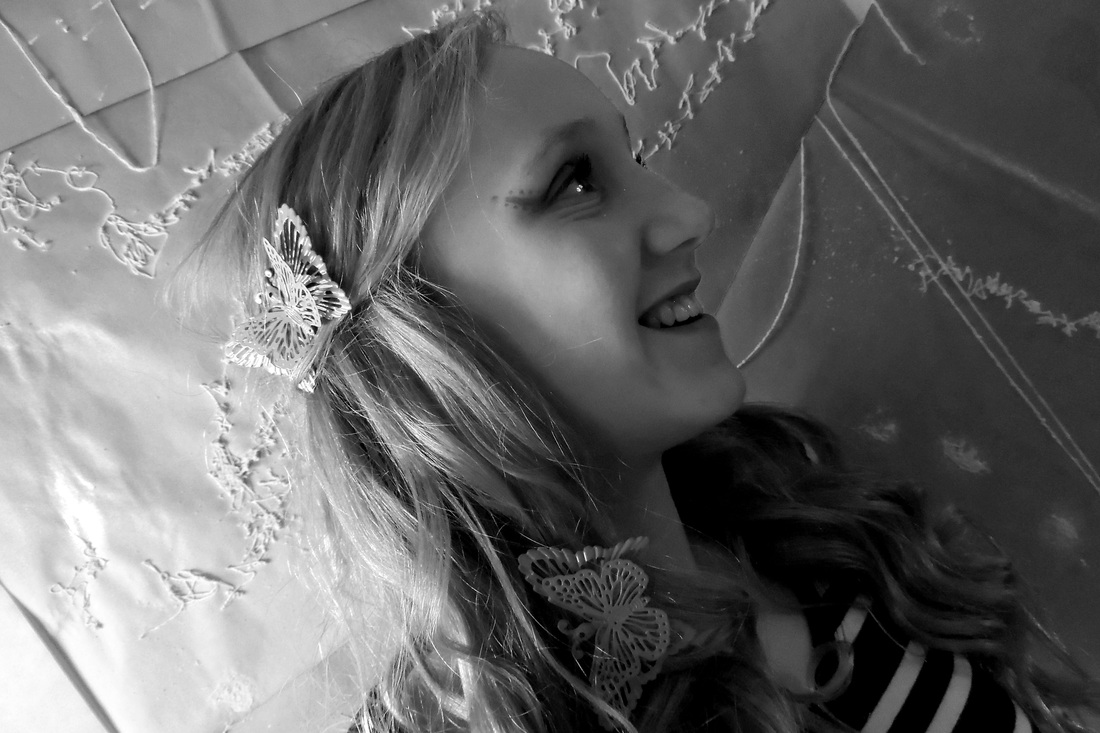
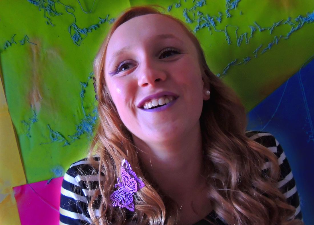
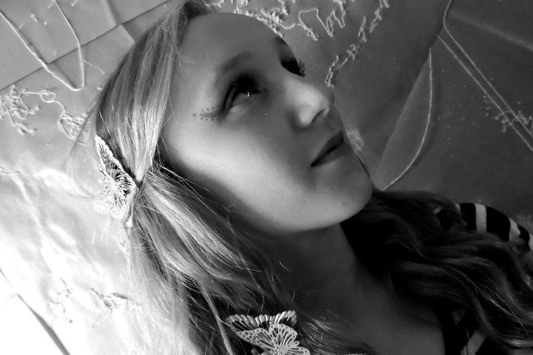
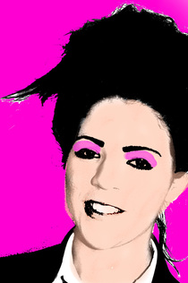
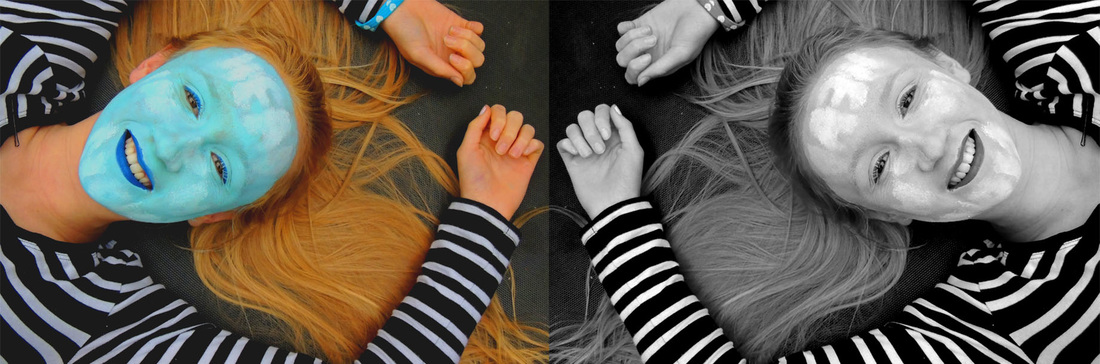
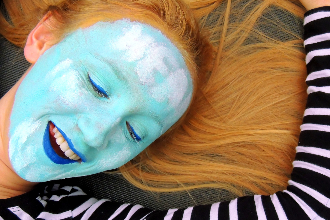
I like the black and white pictures Rankin has taken as it makes them look artistic, so I decided to make some of mine black and white. The effect makes them look older, and I like this one because she is smiling and it looks almost nostalgic |
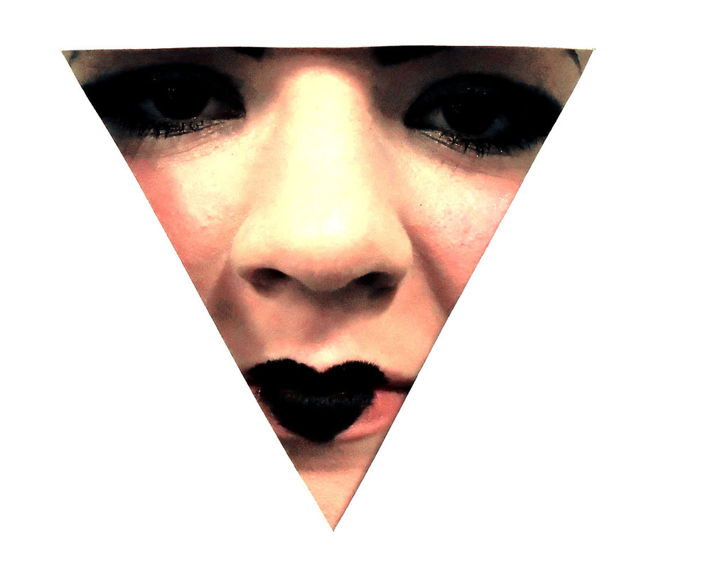
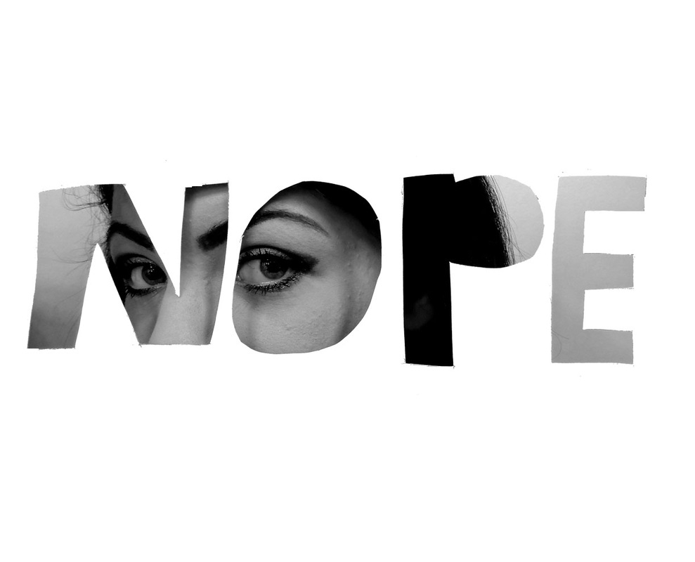
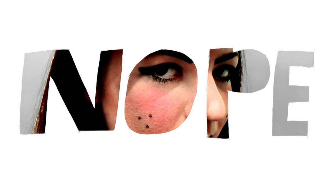
Rankin cut-outs
For these pictures I cut shapes out of a piece of paper with a craft knife, this was inspired by the work Rankin did using the same technique. My particular favorite is the black and white 'NOPE' picture as it looks the most professional.
Andy Warhol
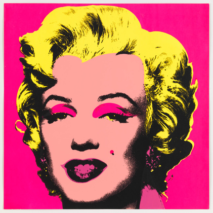
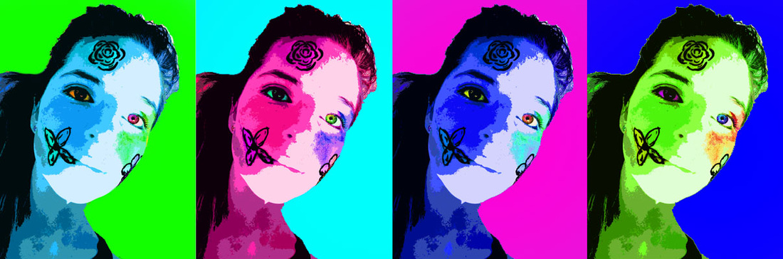
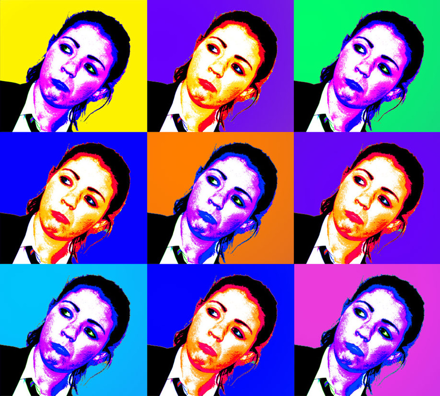
Andy Warhol was born in Pittsburgh, Pennsylvania on August 6th 1928. He was a successful editor and illustrator and became a very important part of the pop art movement in the 1960's. He made a wide variety of different techniques to create his art, such as performance art, film making, and using screen grabs of celebrities, he blurred the lines between art and mainstream media. Pop art means popular art and focuses on mass produced goods, hence the soup tins all painted in different colours. Perhaps creating art works of celebrities in a pop art style was a comment on the way their faces are used as something factory produced and distributed to the masses. he uses lots of bright primary and secondary colours, and also lots of complimentary colours which make for an interesting contrast between the focus of his artwork and the background.
Andy Warhol has inspired many other artists, including David Bowie and Lou Reed who both wrote songs about him (Lou Reed's band: The Velvet Underground was managed by Andy Warhol, who helped them secure a record deal with Verve Records).
Andy Warhol believed that life was art and so tried to sculpt his own image into something artistic and awe-inspiring.
My responses to Andy Warhol

|
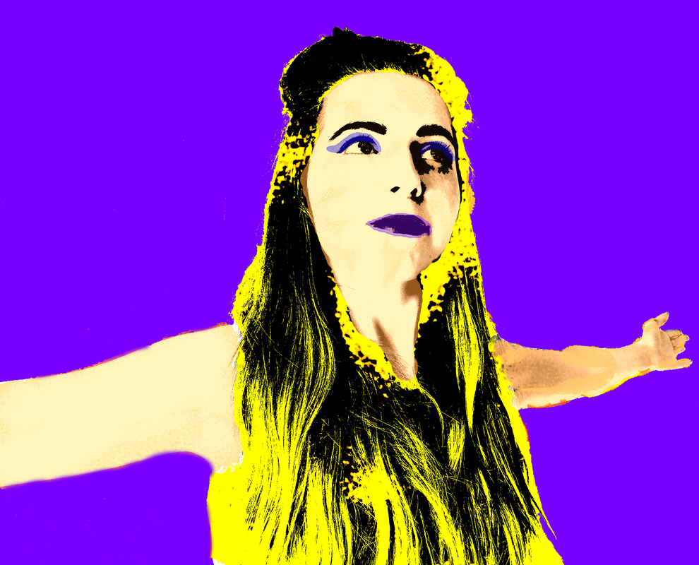
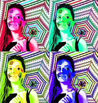
For this picture I desaturated the original picture and then, in quick mask mode, selected the face and painted the colour back on, I also added pink eyeshadow. This was inspired by the technique Andy Warhol used to create some of his artworks called screen printing. |
|
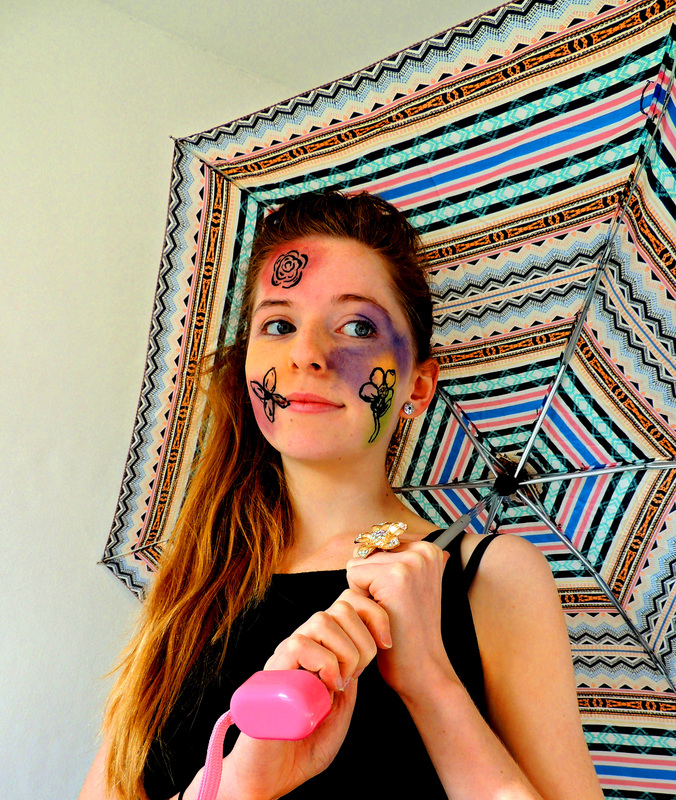
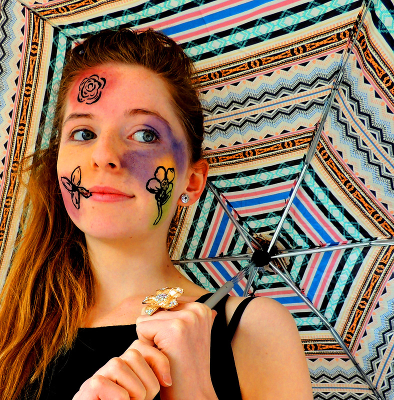
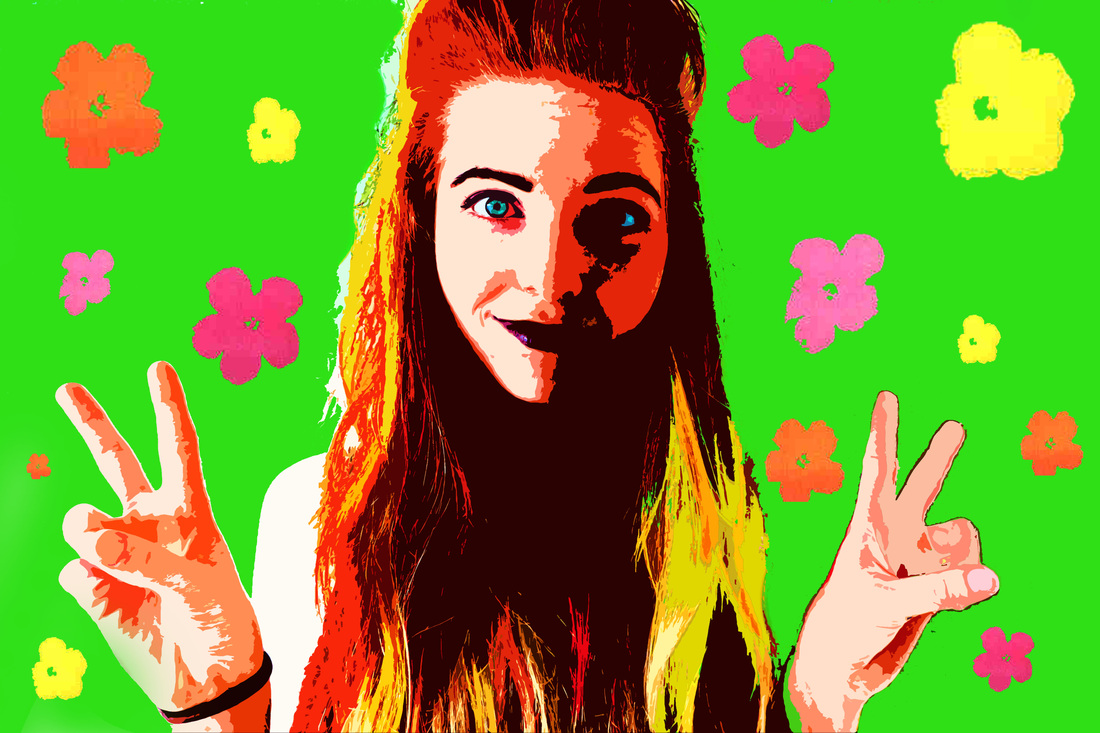
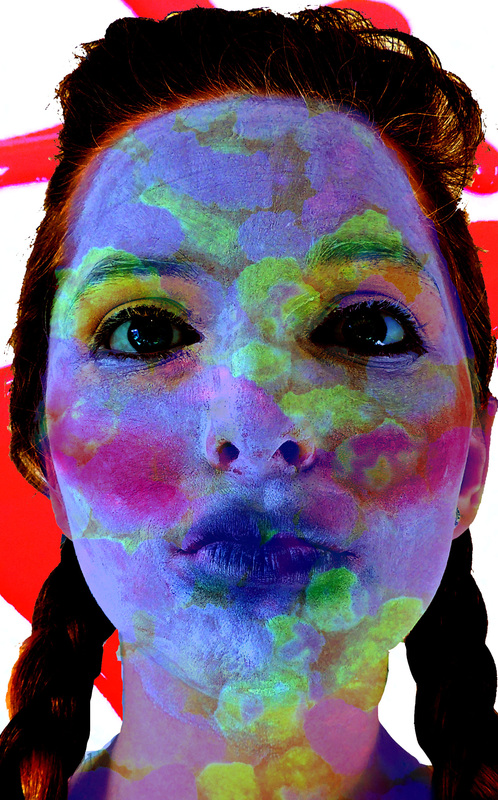
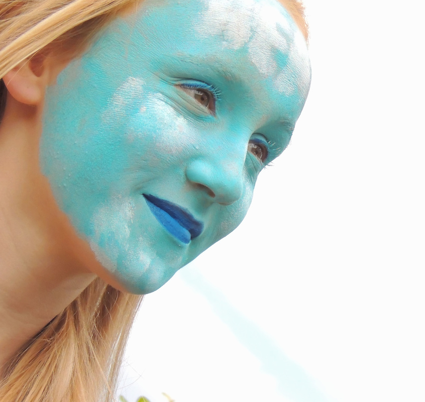
For this one I used some flowers from one of Andy Warhol's art works, I did this because I liked his artworks and thought that particular one would add something to the picture, which it does. I used a mask to create the affect with the shadows and highlights which makes them look block like and less detailed, this suits the Pop Art style becauseit is bring and simplistic, but also affective. |
|
Akatre
Akatre are a French graphic design company founded in 2007 by Valentin Abad, Julien Dhivert and Sebastien Riveron. They work in a veriety of feilds including photography, typeography, graphic design and video; mainly around visual identity, art, fashion and culture. They use a wide range of materials, like paper, face paint, straws, manequins and card. They use sculpture in a lot of their work and also costume to create experimental and visualy stunning works of art, some of their photography is surreal and almost dream-like, they use seethrough wires to make it look as if objects are floating and create words out of coloured wire in the air. They are a very highly sought after design studio and create luxury works of art for thire clients.
My responses to Akatre


|
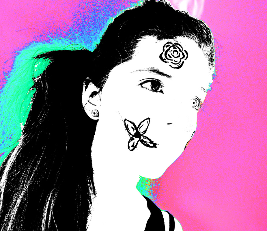
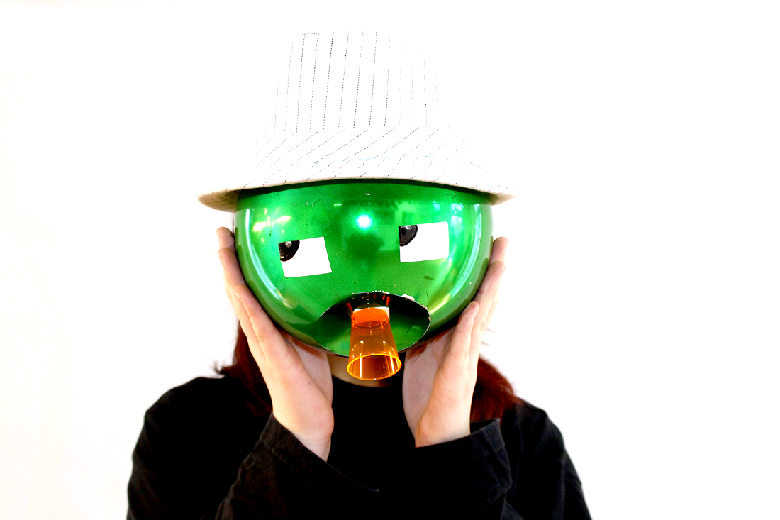
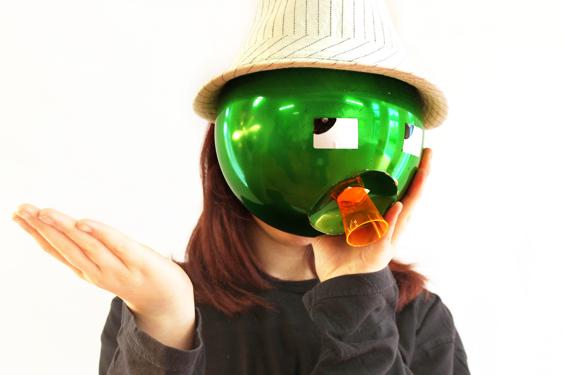
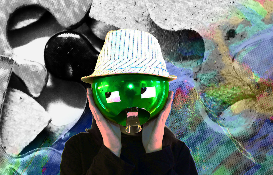
For this photo I used a dented bubal and stuck eyes and a shot glass to it to create a face, his name is Kevin. This was inspired by Akatre's use of busts and mannequins instead of people, like portrait but not of a real human, giving something inanimate a personality. |
|

|
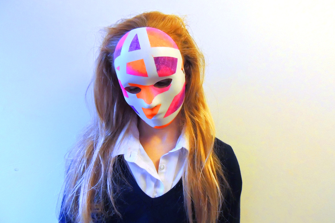
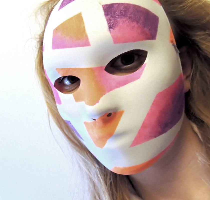
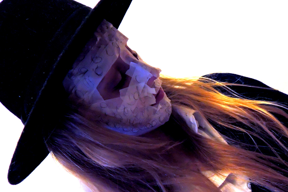
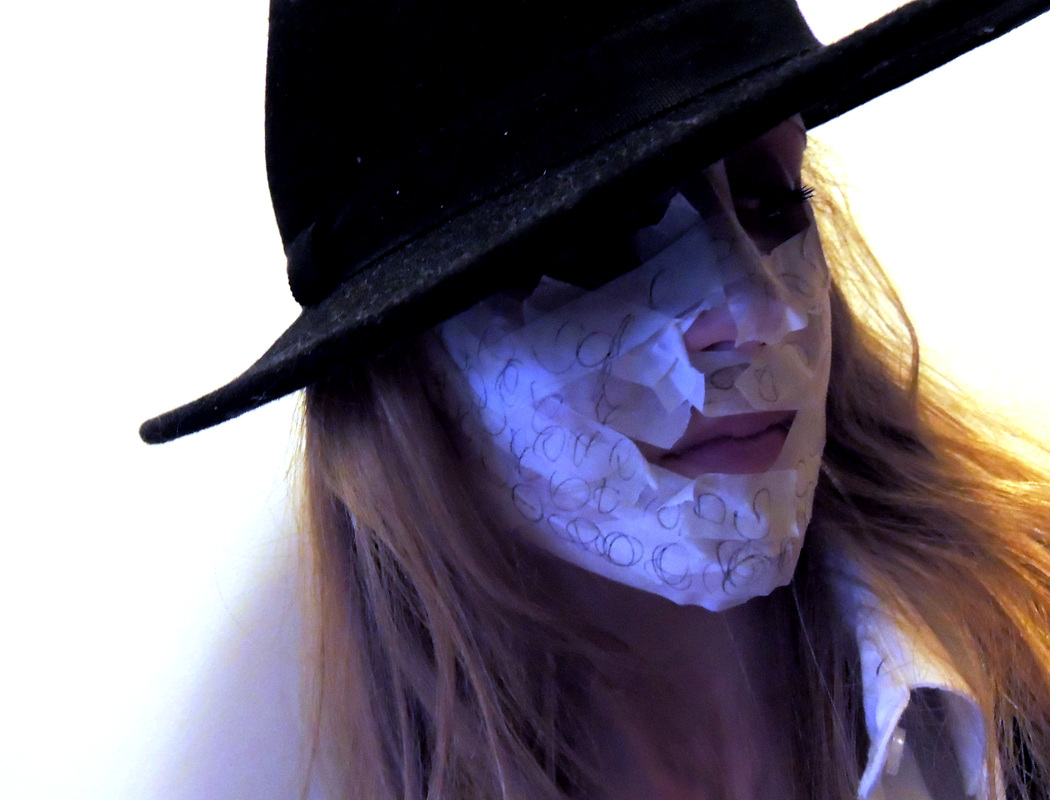
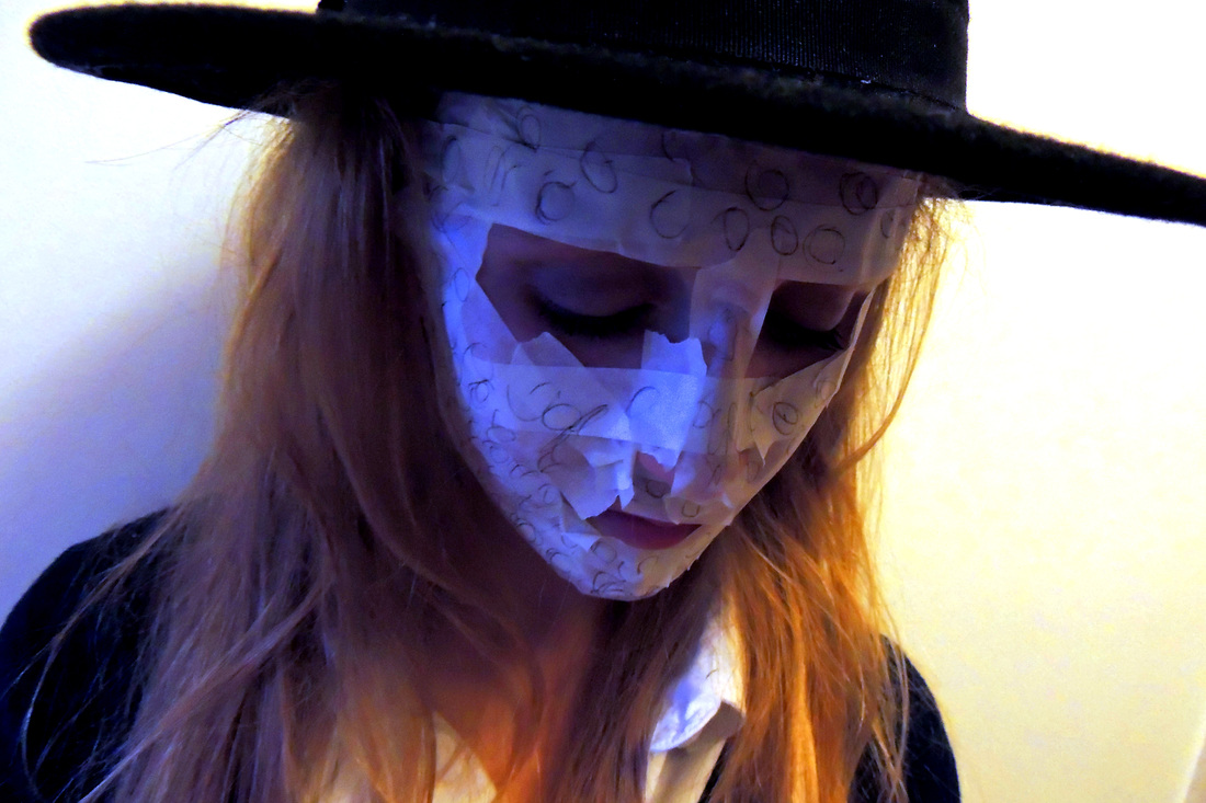
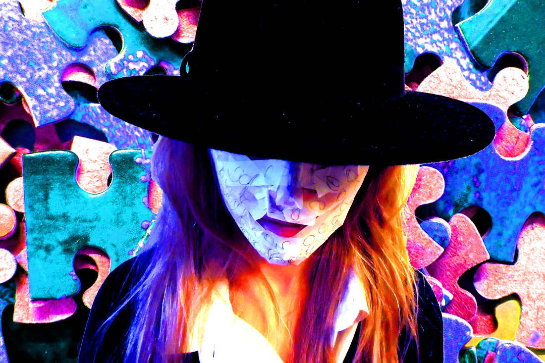
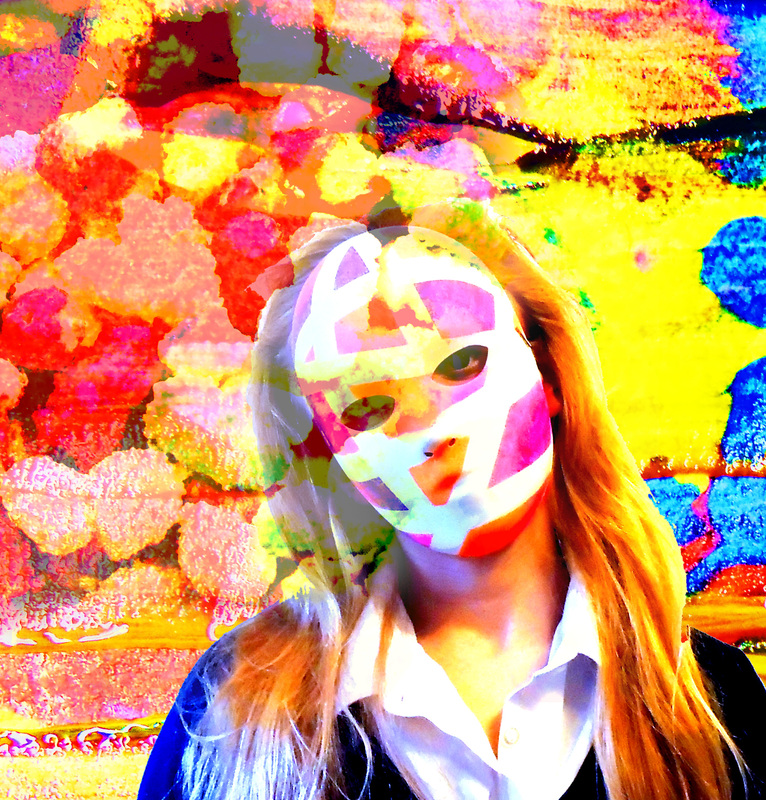
I like the mood this picture has and the fact that the mask looks vaguely unsettling, it gives it a more interesting feel when the face is obscured in this way. I also like that the shadows and the colour of her hair compliment the mask, it brings the picture together. |
|
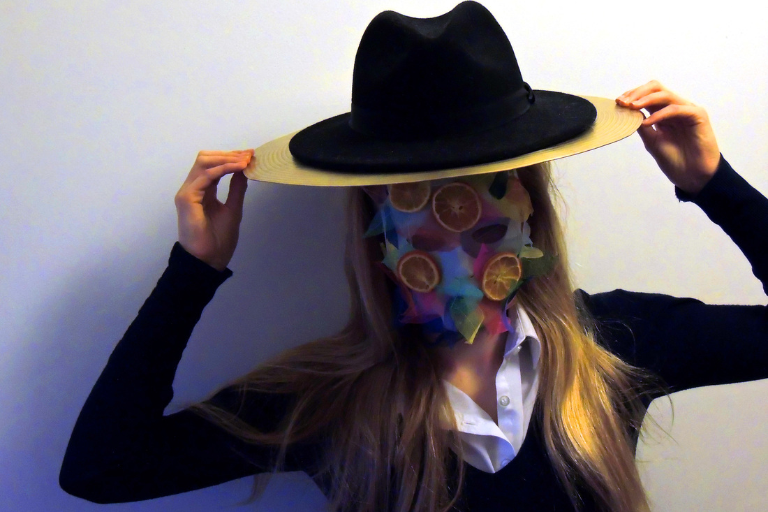
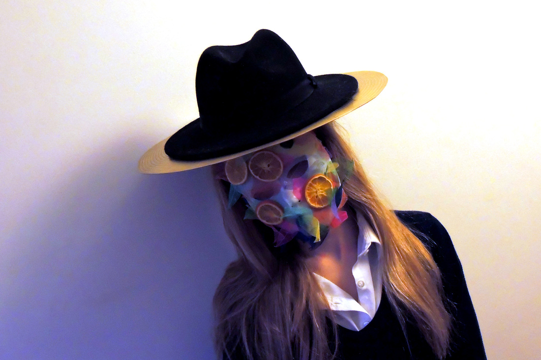
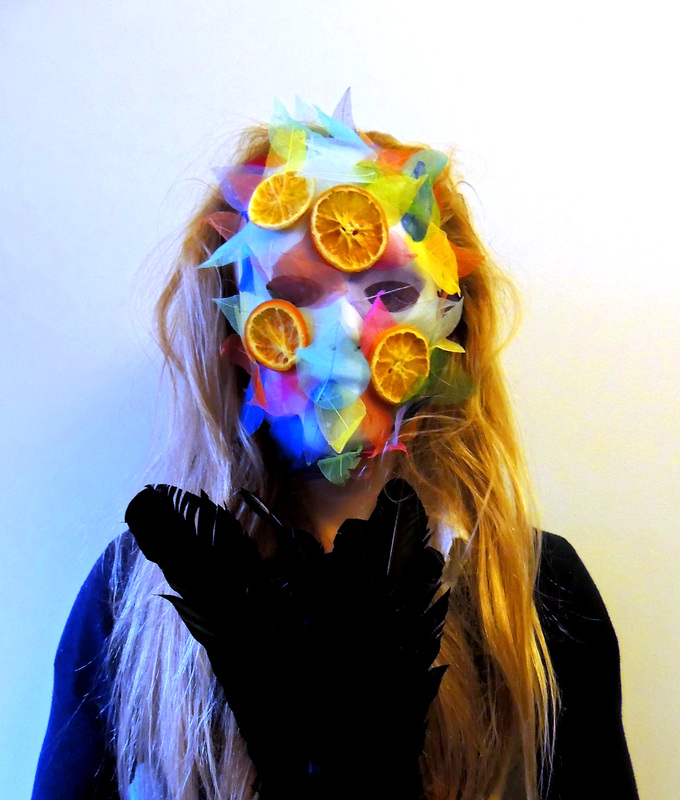
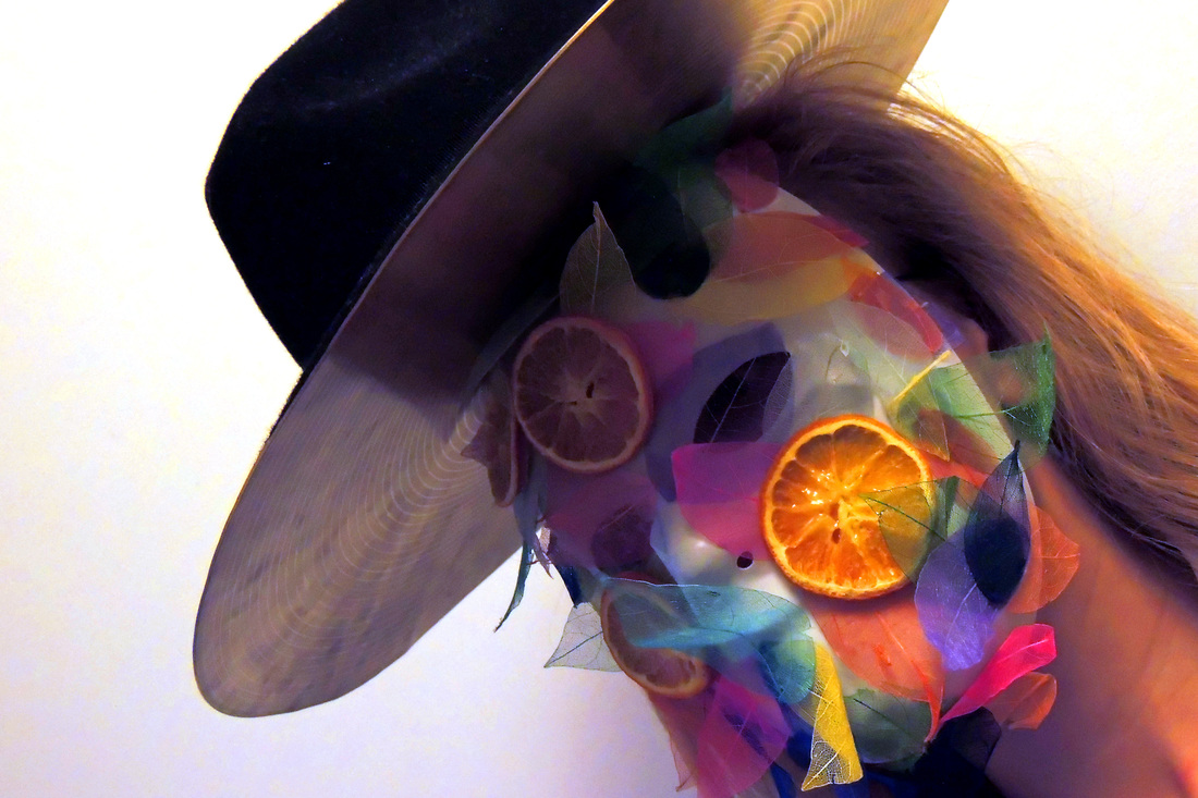
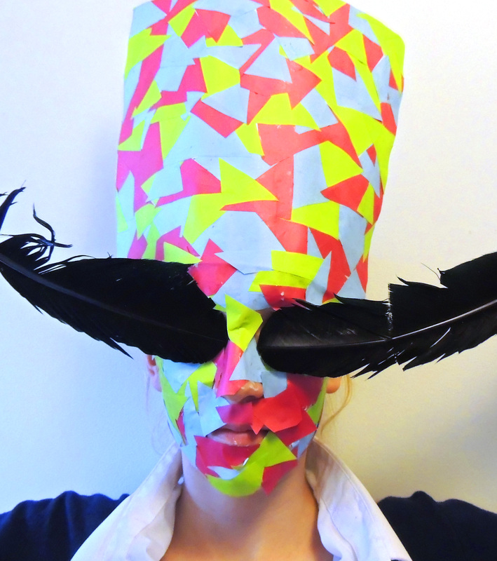
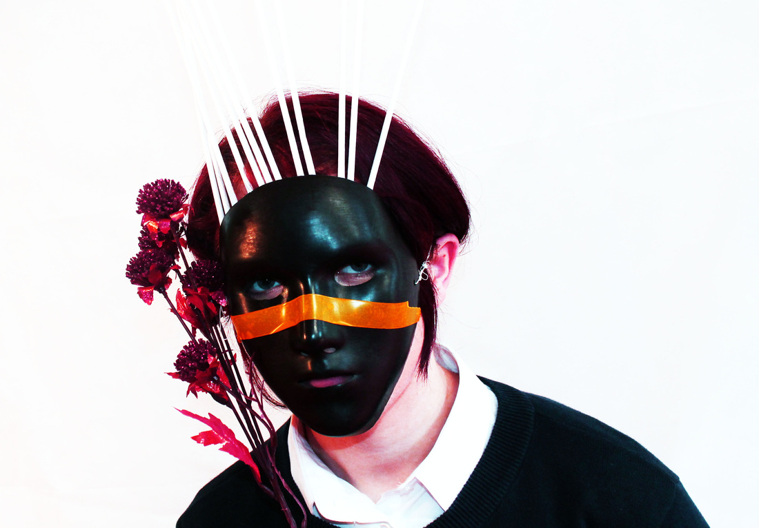
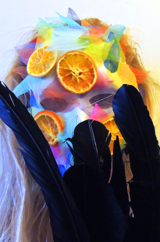
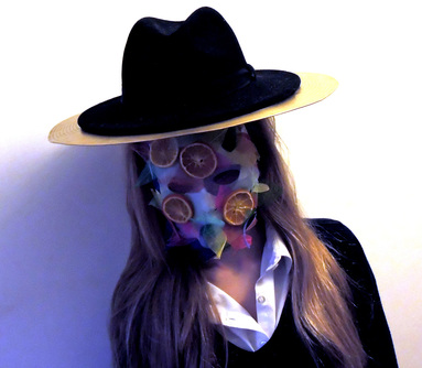
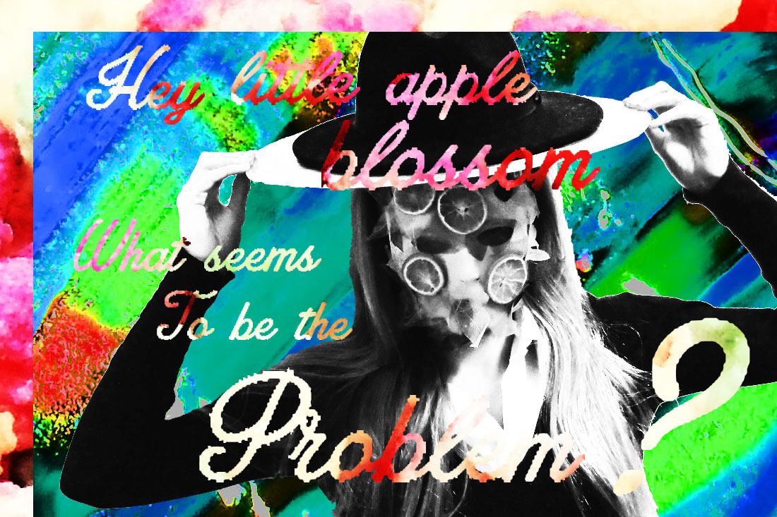
For this picture I used a crash cymbal to create a more interesting hat and made a mask using colourful leaves and orange slices which was inspired by the masks Akatre use in their work. |
|
|
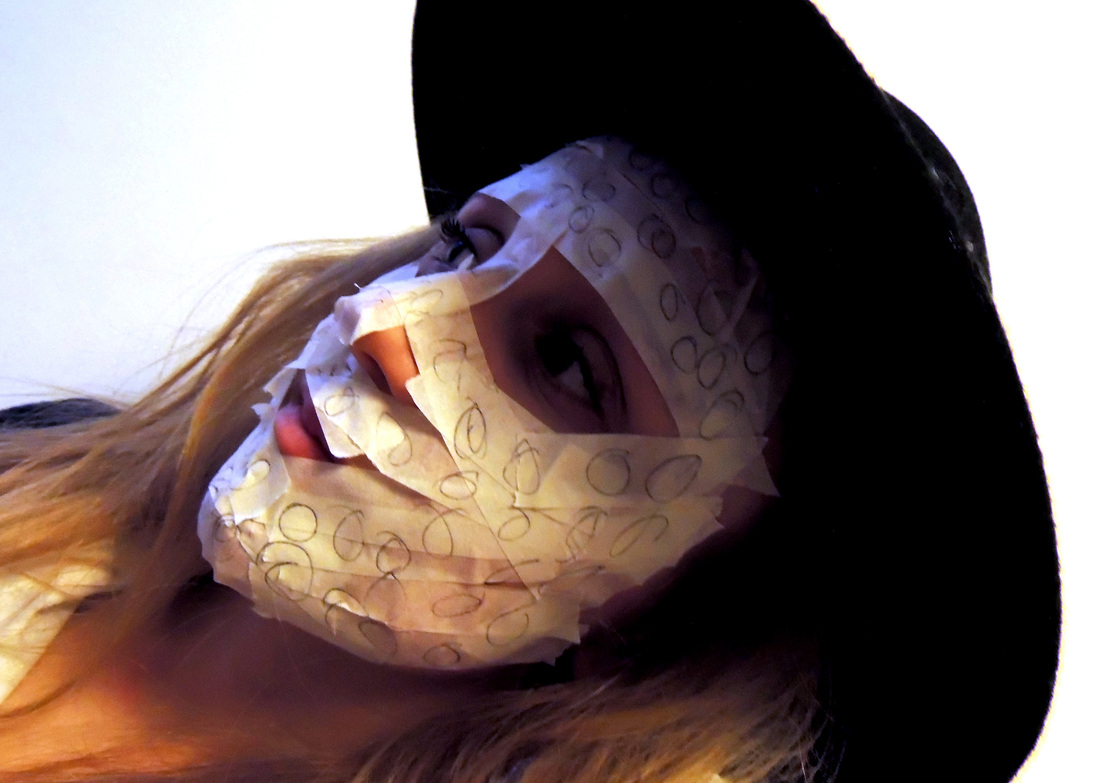
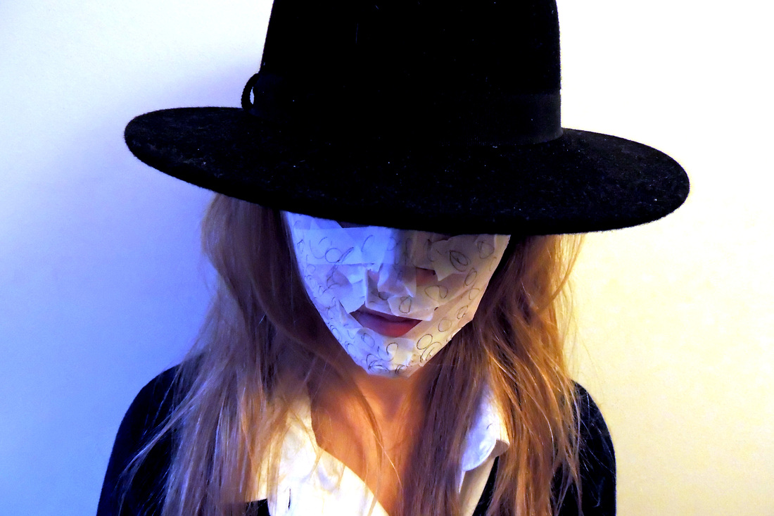
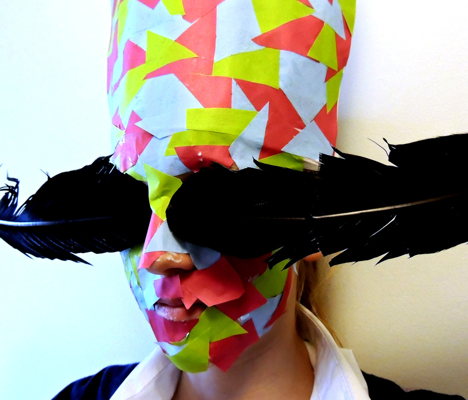
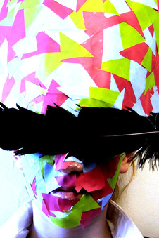
This picture was inspired both by the picture with the pencil shavings and also by the one in which the eyes of the subject are blurred out. I created a collaged sheet of paper which I then glued to the subjects head, I then used glue to cover the subject's face in more colourful paper, I love this effect for the abstract and weird feel it has. The feather adds an extra layer of interest and the dark colour contrasts with the bright colours of the mask. |
Refining my responses to Akatre


|
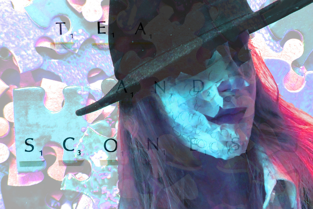
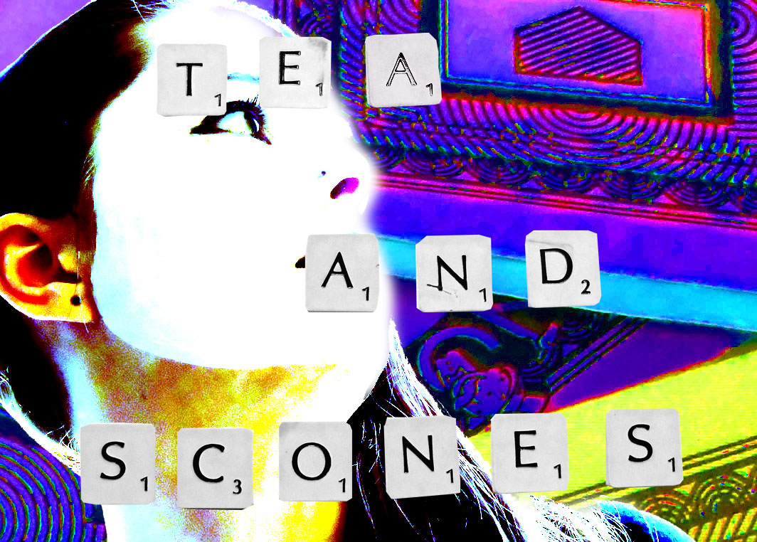
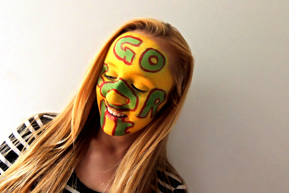
I like the affect of the text over the face in this photo. As well as looking affective, it also combines something that is stereotypically English (tea and scones) with bright and interesting colours of pop art.
|
|
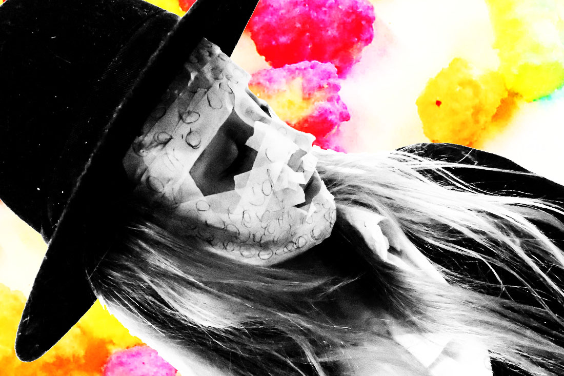
This is one of my absolute favorite edits, I love the contrast of the black and white and the pinks and yellows in the background. The two things are a contradiction, the background being bright and happy and the person in the foreground is dark and melancholy. I also really like the angle at which she is looking as it adds to the mood. |

|
|
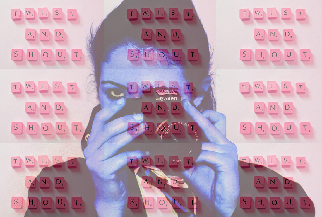
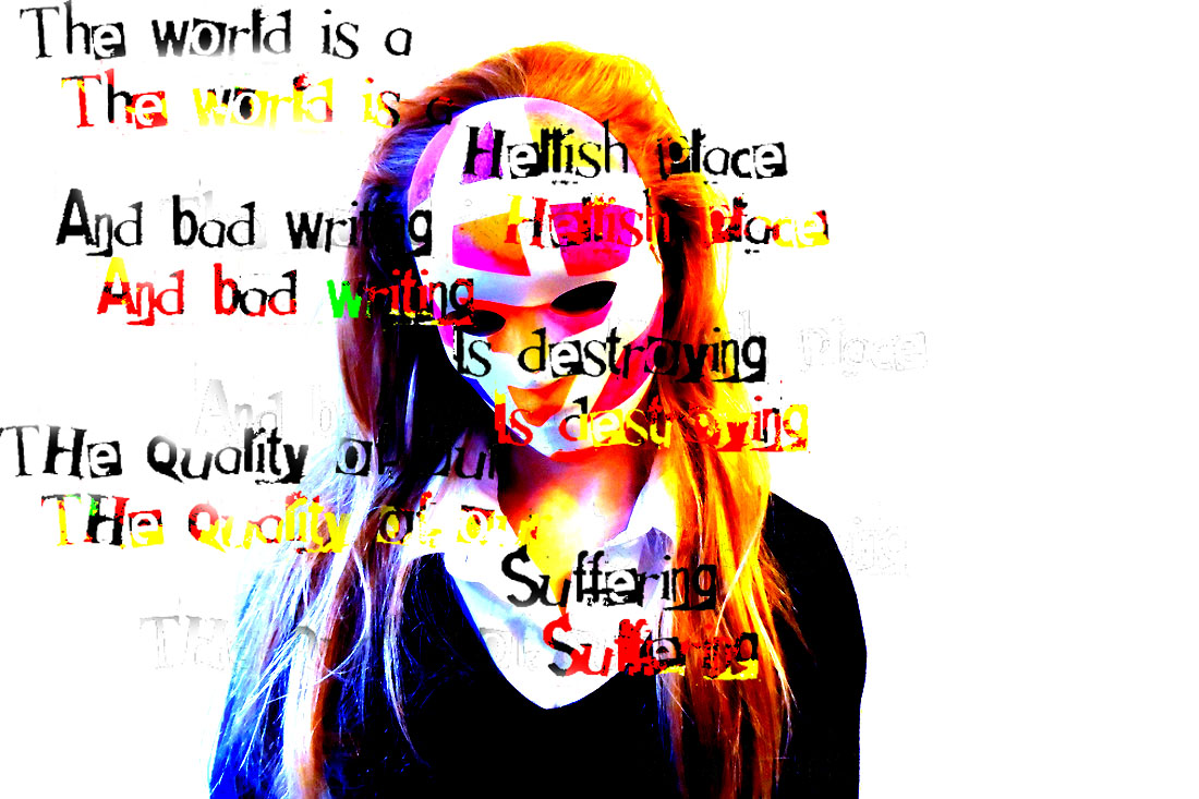
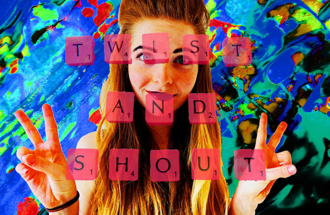
I like this picture because it looks like it has an almost festival-ish atmosphere, which is made by the Beatles quote and the colours of the letters and the background, and also by the the pose she is doing. |
|
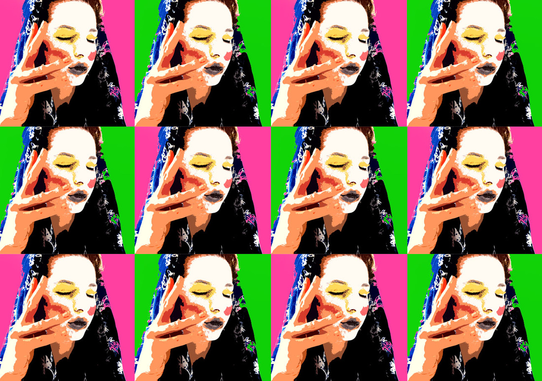
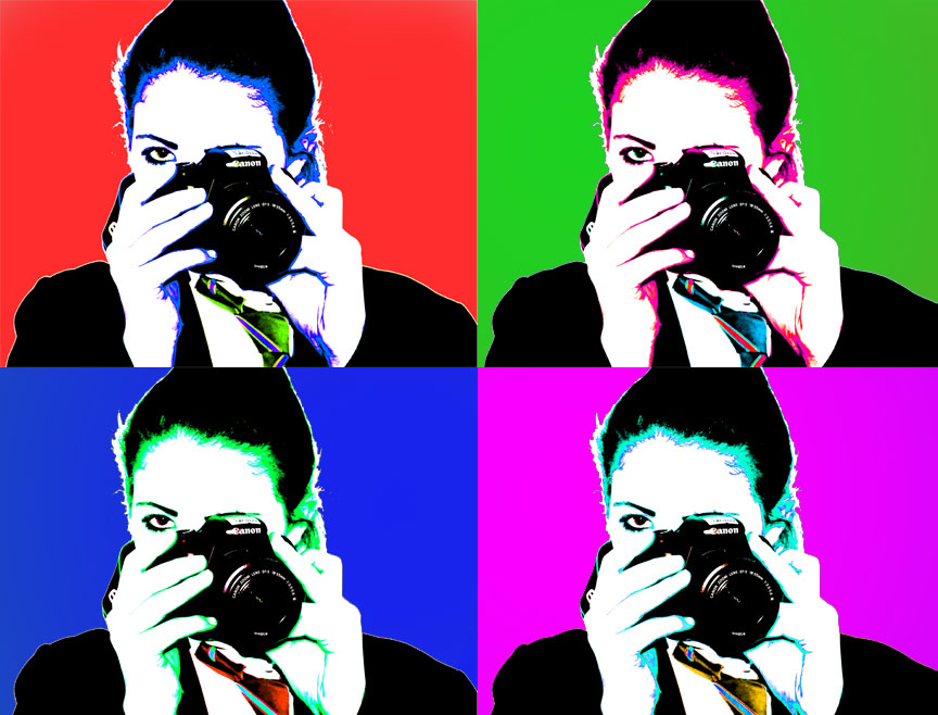
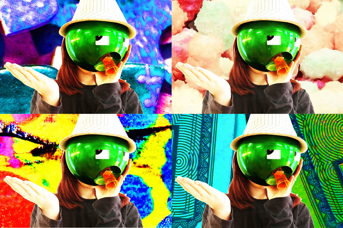
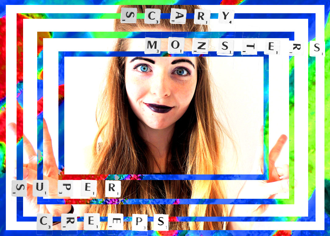
This edit was inspired by the work I did on Andy Warhol. I liked the use of the same image repeated over and over but with different colours, and thought that for this I could change the background instead of the colour of the image. I really like the affect of the combination of all the different patterns forming one picture. |

|
|
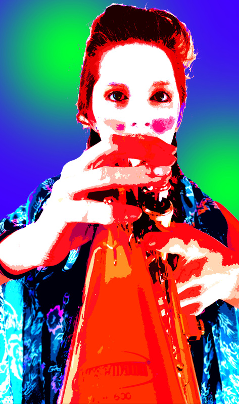
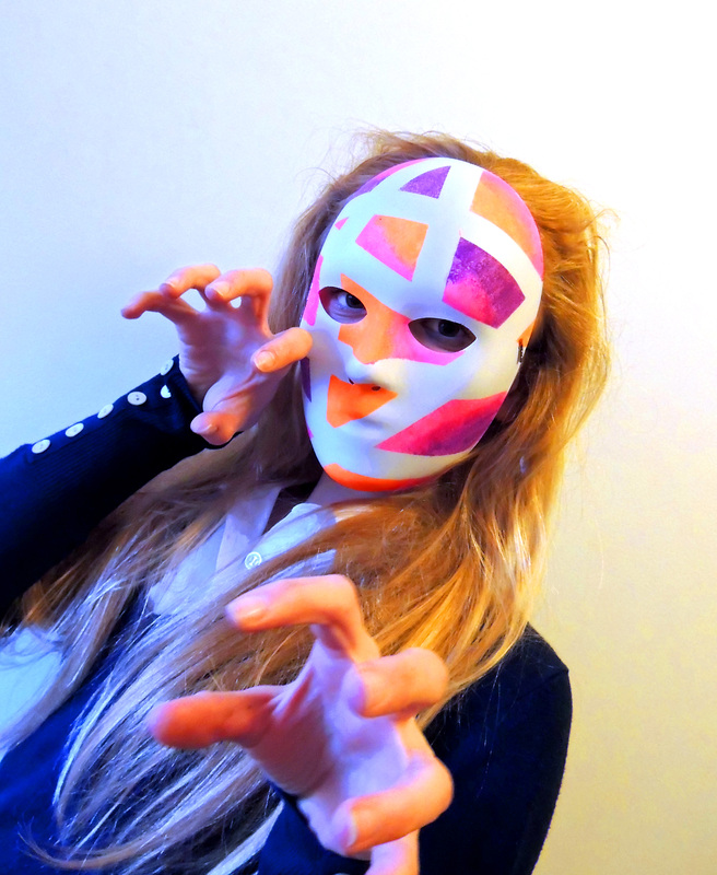
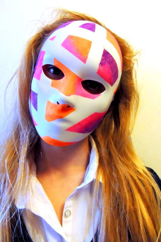
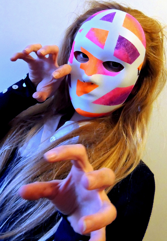
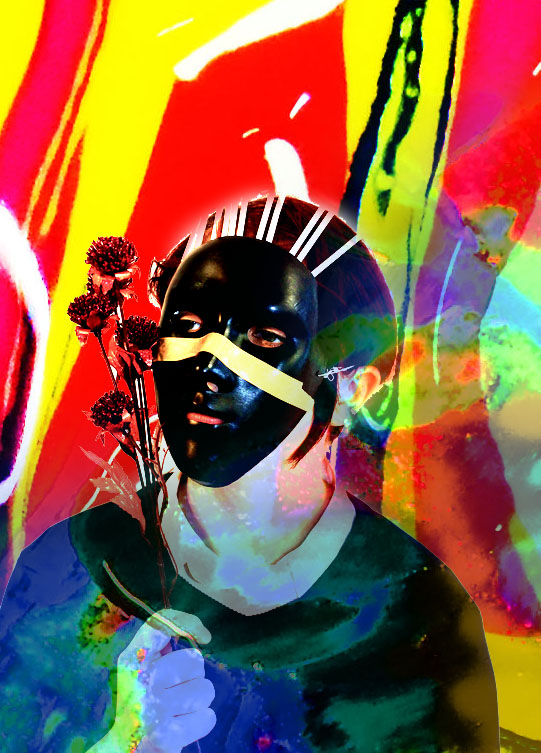
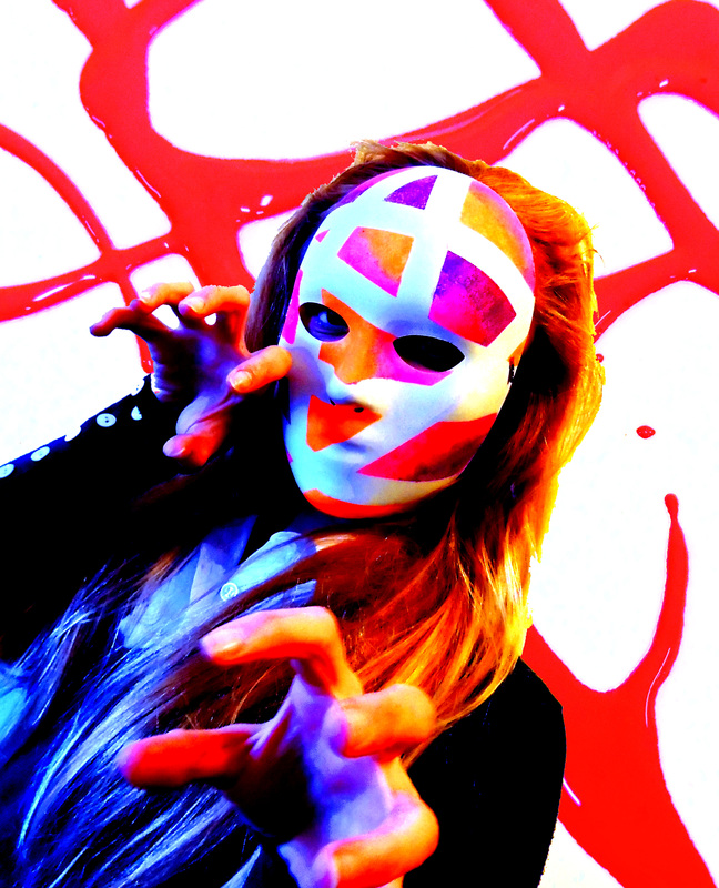
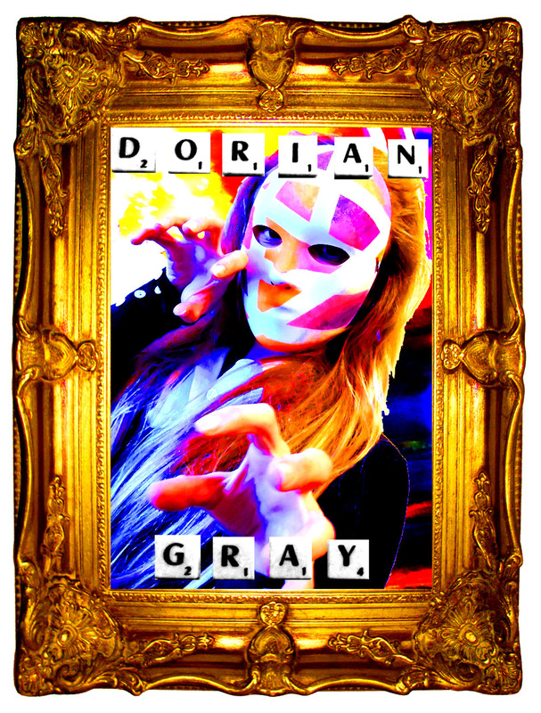
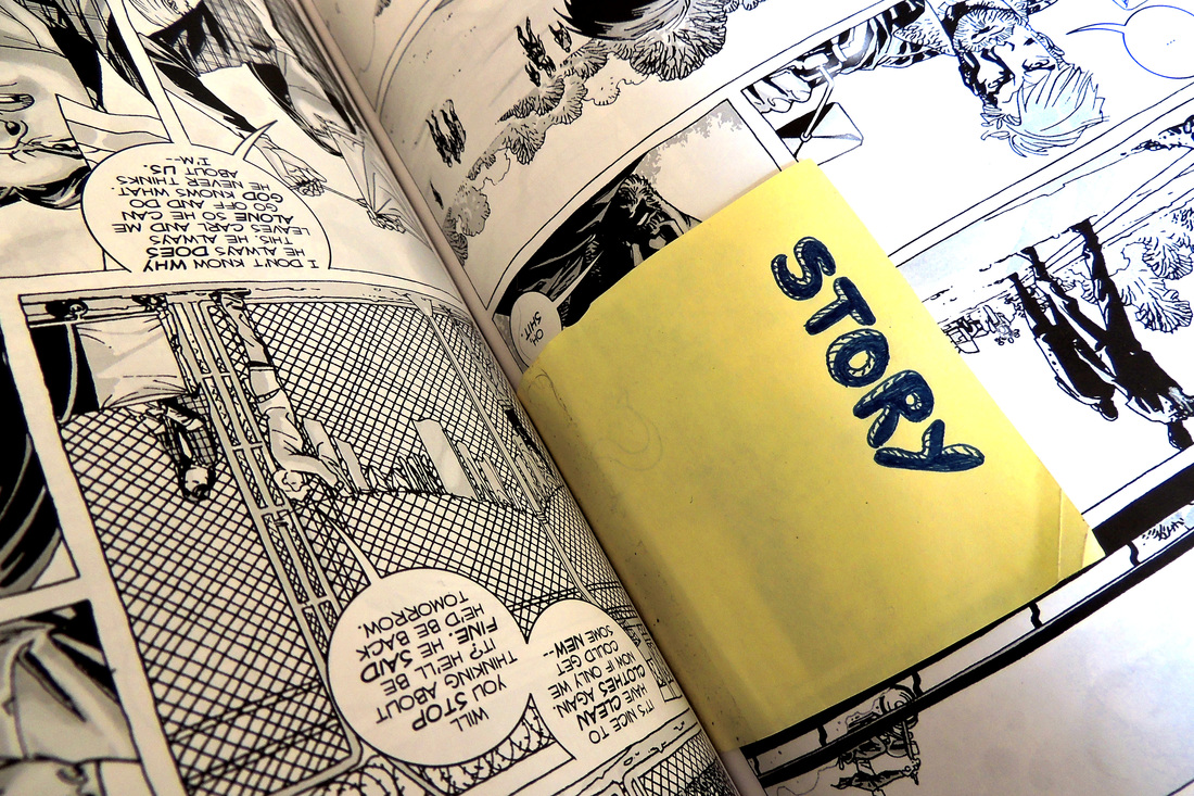
This edit was inspired by the Oscar Wilde novel 'The Picture of Dorian Gray' I enjoyed the story and the writing style and I was inspired to make this when I saw this picture with the mask and the hands like claws. I liked the idea that this was a more light-hearted version of the portrait Basil Hallward paints of Dorian. I also like the contrast between what would have been oil on canvas and the modern tool of Photoshop. |
|
For this I cut out strips of the picture rather than cutting around the person and sticking them on the background, I like this affect because you can see the background in stripes, rather than as one big block. I also used the David Bowie quote because I think it lends some contrast to the rest of the picture.
|
|
Stefan Sagmeister
Stefan Sagmeister is a graphic designer and typeographer, he was born in 1962 in Austria. He is based in New York and cofounded the company Sagmeister & Walsh with Jessica Walsh. He went to the University of Applied Arts in Vienna and has also designed album covers for Lou Reed, The Rolling Stones and others. Sagmeister received a Grammy Award in 2005 in the Best Boxed or Special Limited Edition Package category for art directing Once in a Lifetime box set by Talking Heads. He received a second Grammy Award for his design of the David Byrne and Brian Eno album Everything That Happens Will Happen Today.
In 2006, Stefan Sagmeister published Things I have learned in my life so far, a book inspired by the running list he keeps in his diary. With the help of his clients, Sagmeister began transforming these personal epigrams into typographic artworks, which appeared on billboards, in magazines, and in public spaces all over the world. He used perspective in creating a lot of the works, by aranging materials in such a way that the word can only be seen from a certain angle. Other works were created using coins and sugar and even bananas.
Sagmister's "The Happy Show" was first conceptualised by Sagmister, who has struggled with depression, in an attempt to define and control his own happiness through meditation and cognative therapy, the show is desinged to be like walking through his mind. it is the result of 10 years of reserch into his own personal happiness. He uses a wide range of inforaphics, interactive displays, video displays and even a giant inflatable monkey to present the viewers with storys of wellness and mindfulness.
My responses to Stefan Sagmeister


|
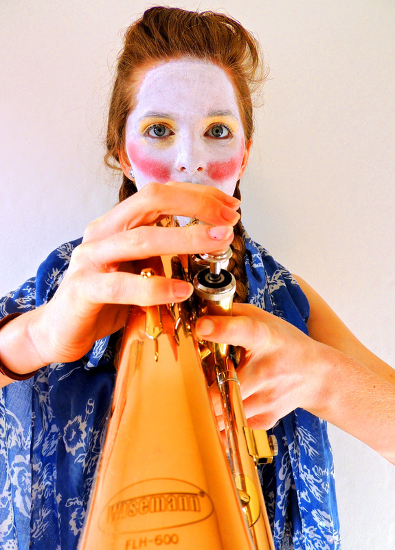
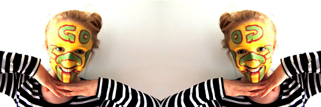
This picture was inspired by the Sagmeister pictures where he painted messages on people's faces, a lot of his messages are positive or about being happy so I thought I would use those ideas in my work. |
|
|
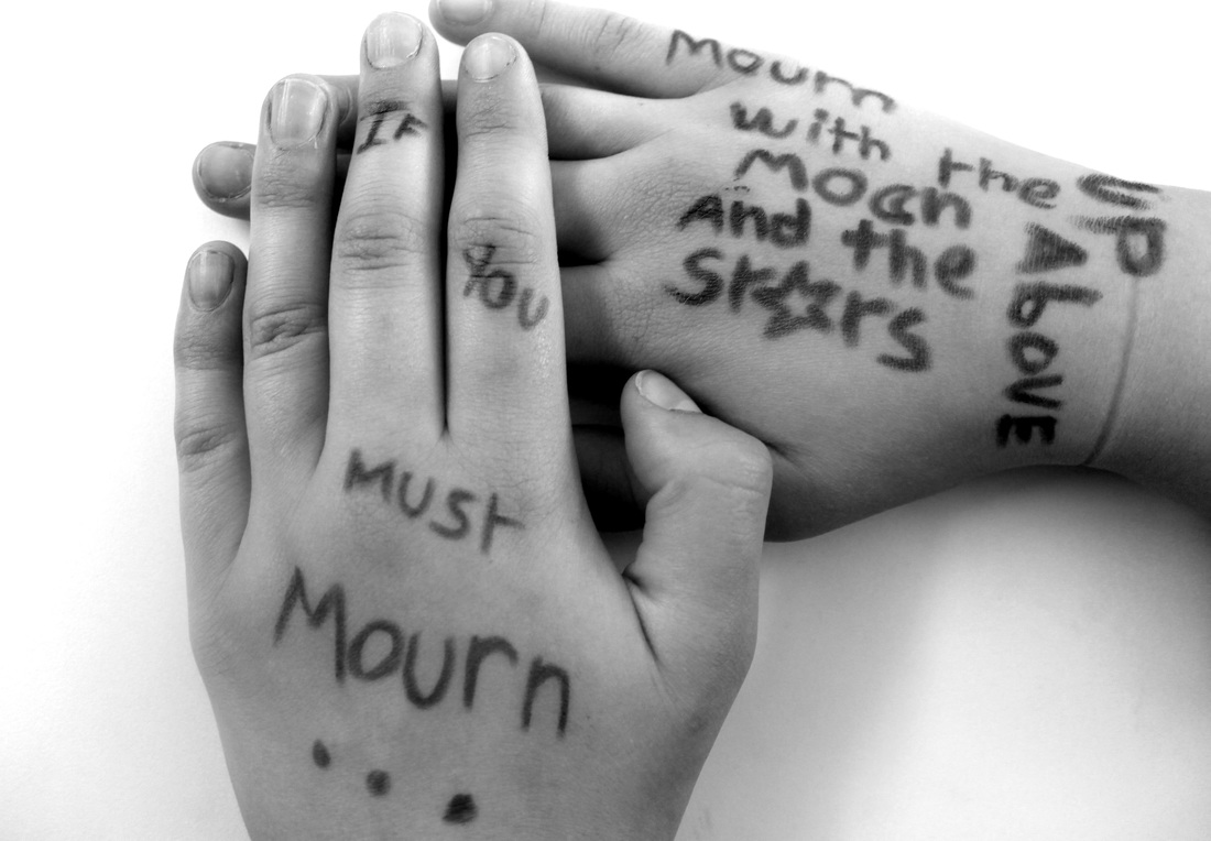
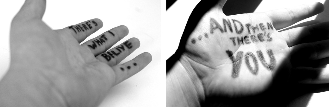
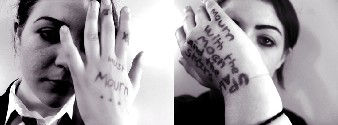
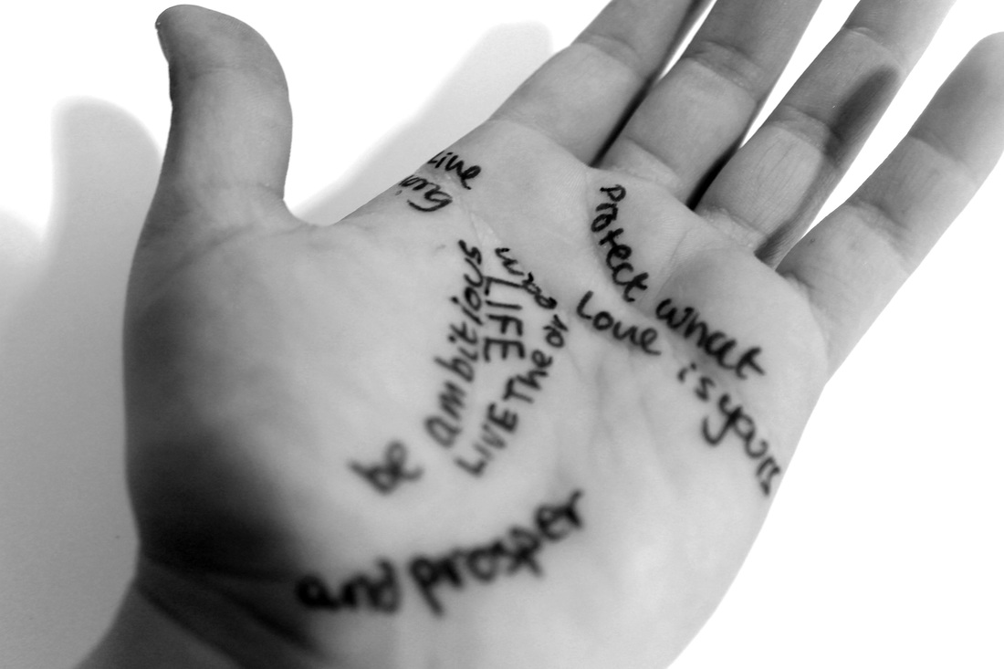
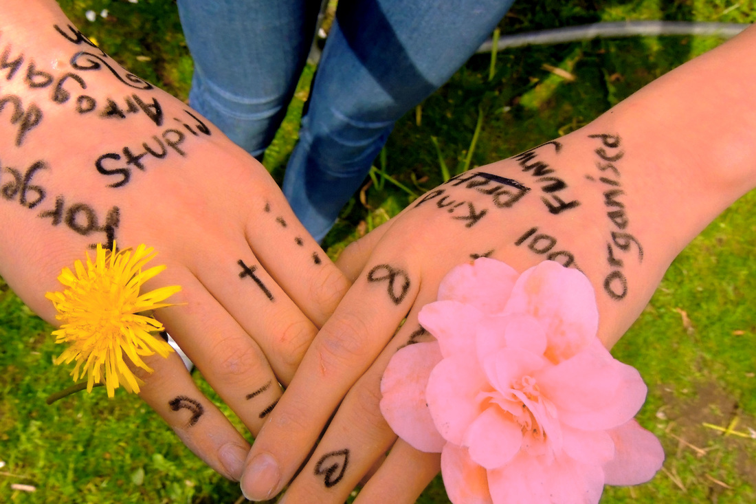
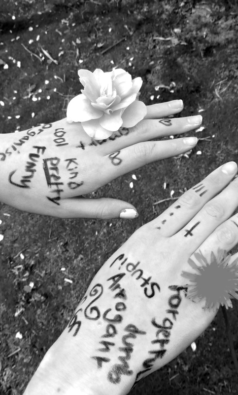
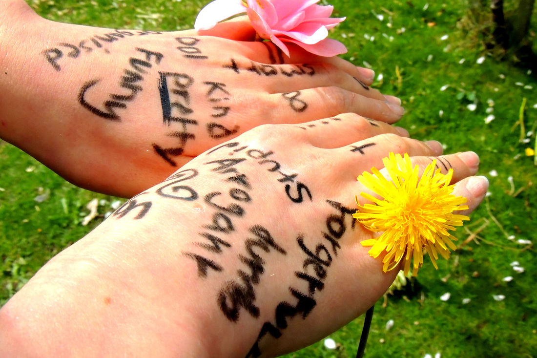
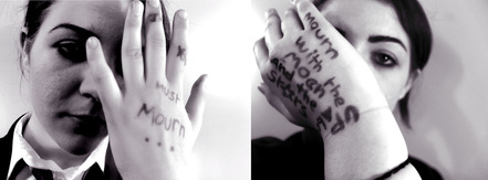
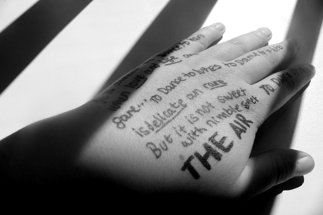
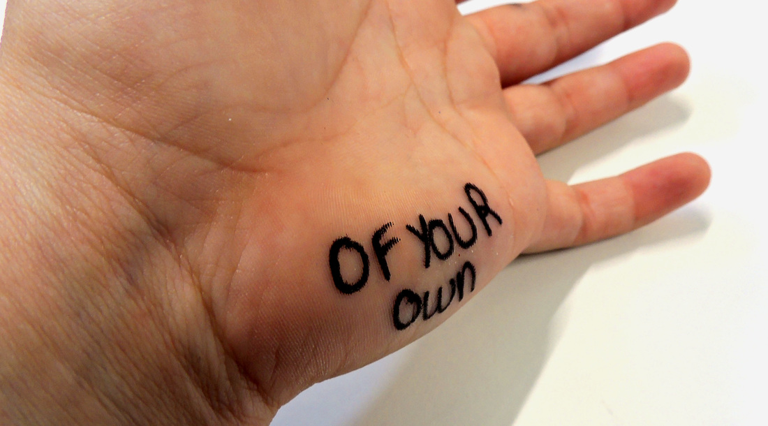
This picture conveys the importance of doing things wholeheartedly and it uses the mood of the picture, created by the black and white and also her facial expressions, and the quote to do this. The lighting I used, the contrast also adds to the mood because the light and dark symbolise that darkness is a necessary part of life but so is the light. People write things on their hand's they have to remember which is why I have used them for this because the message on her hands is an important one and so the hands symbolise the importance of remembering the message.
|
|
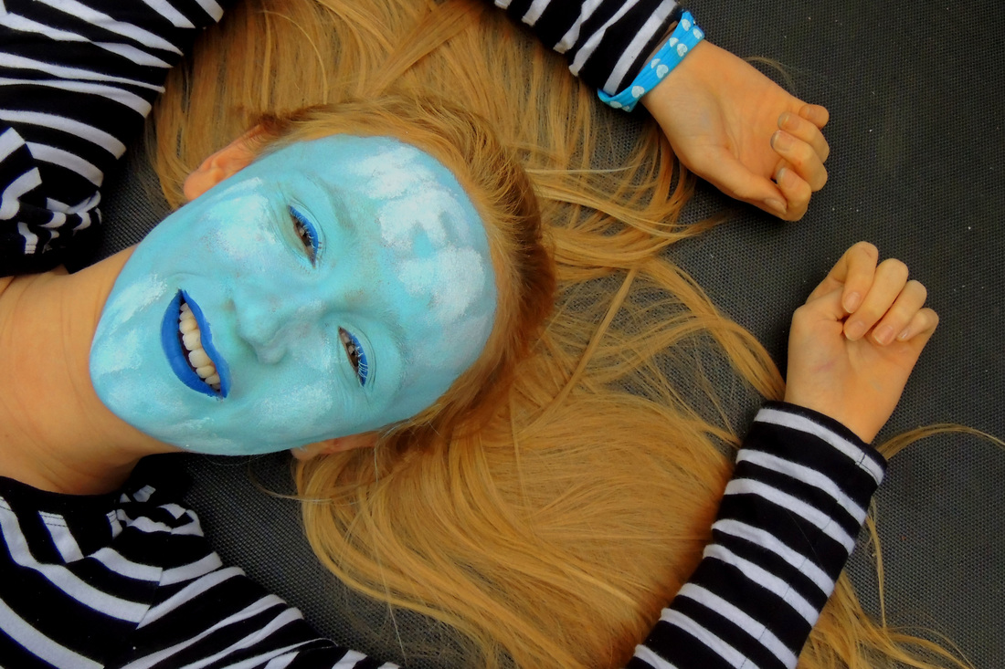
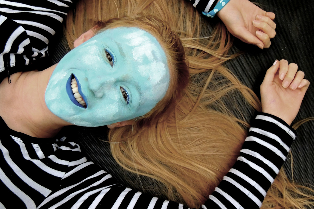
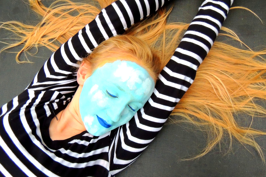
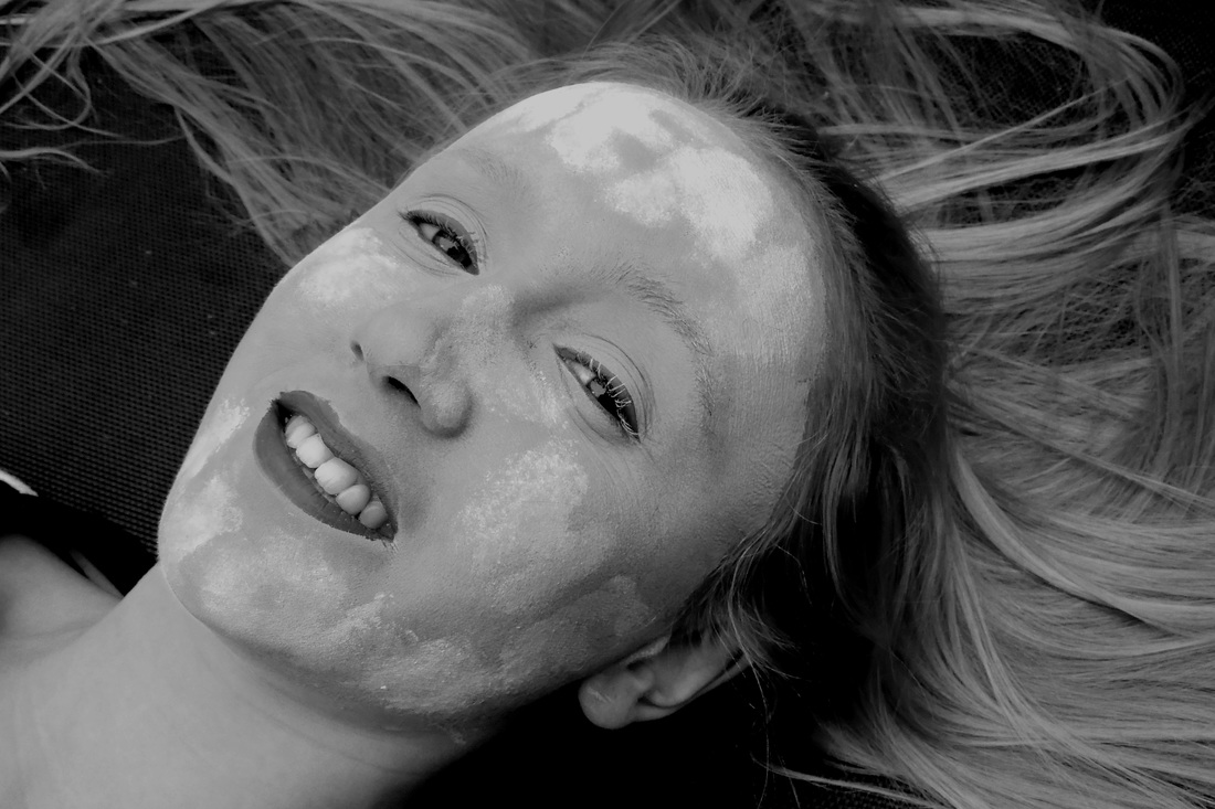
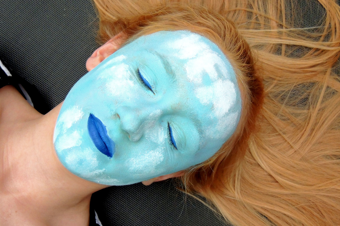
I had her lying down for this picture because I liked the way it made her hair look a bit like a cloud around her head and also it looks like she is sunbathing which matches the theme of "head in the clouds". |
|
|
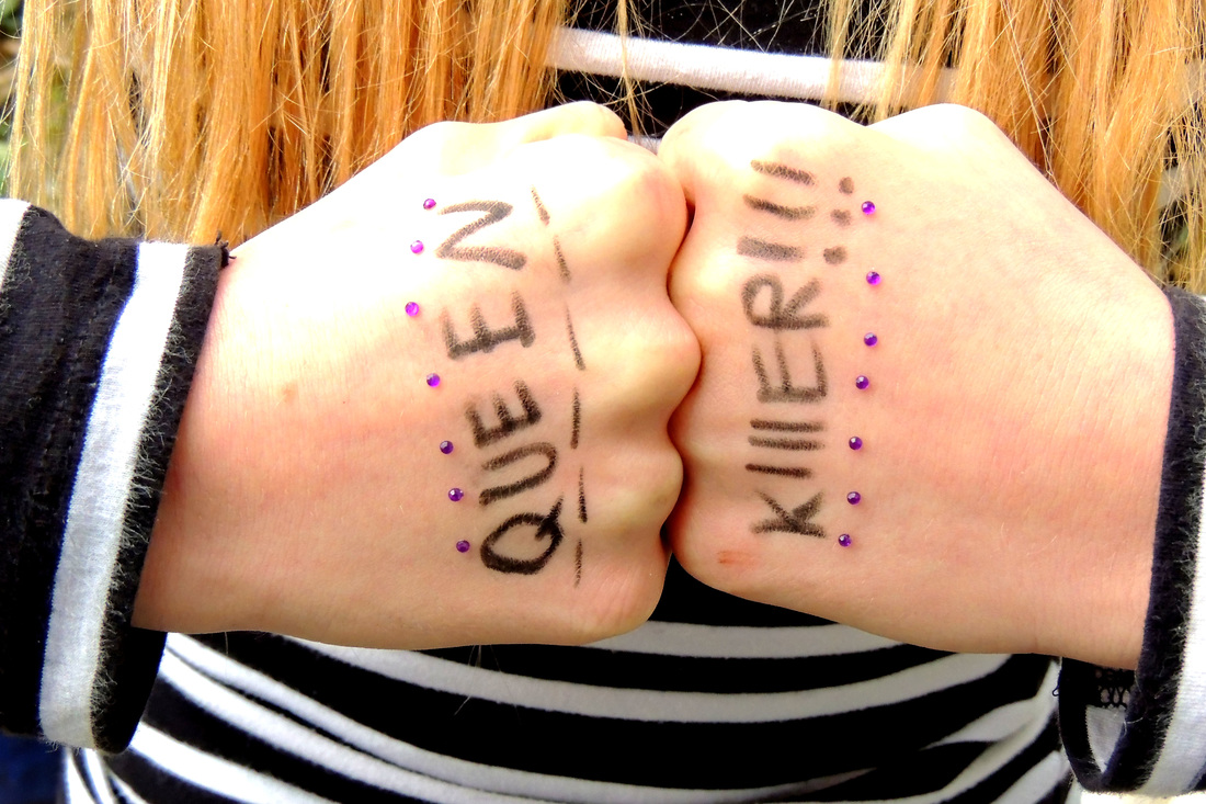
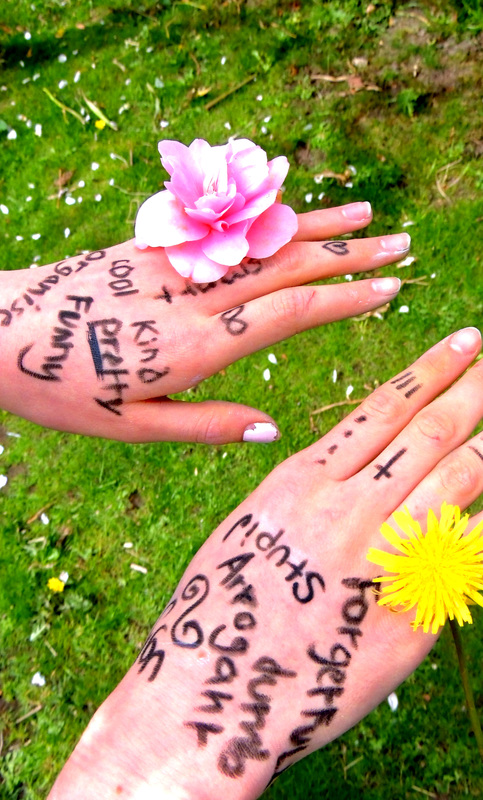
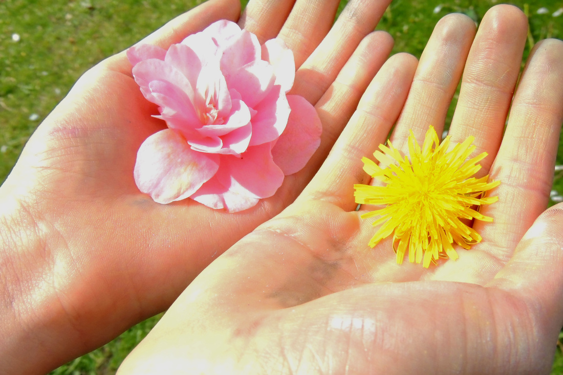
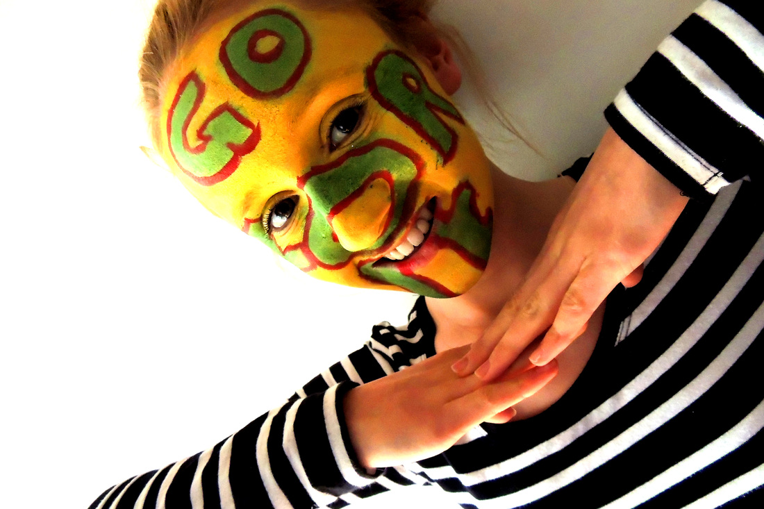
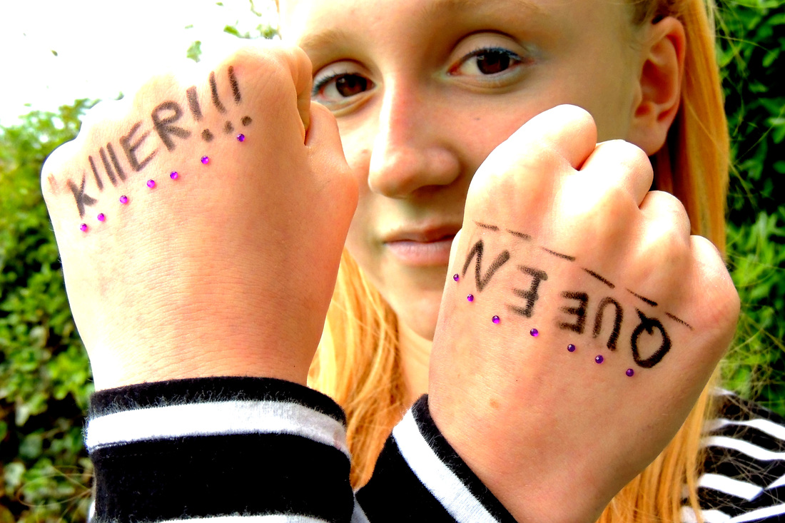
I used the "killer queen" quote from Queen because it emphasises the importance of believing in yourself and feeling confident when used in this context. Also writing on the knuckles is associated with being tough, something that is reinforced by the way she is standing. |
|
I used a quote form the ballad of reading goal for this picture and, because the poem is about a prison I thought the shadows created by the blinds would help emphasise the meaning of the poem. |
|
More responces to Stefan Sagmeister creating text with objects
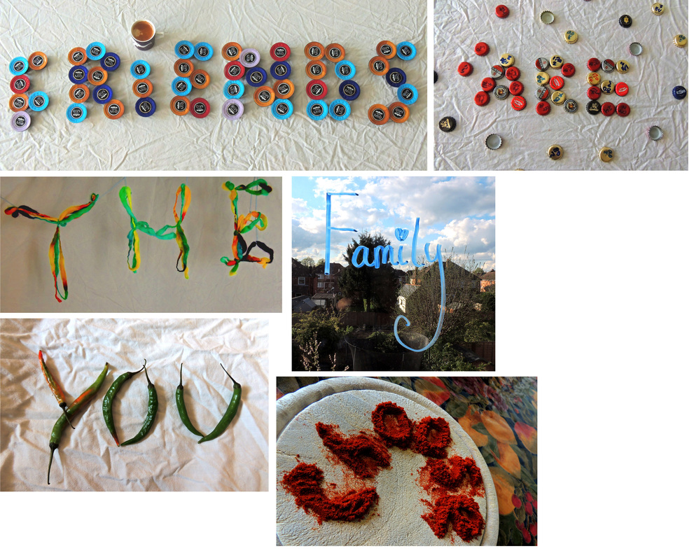
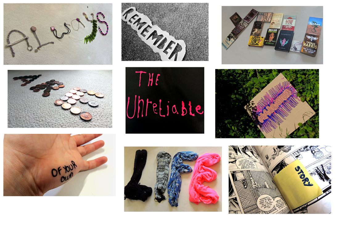
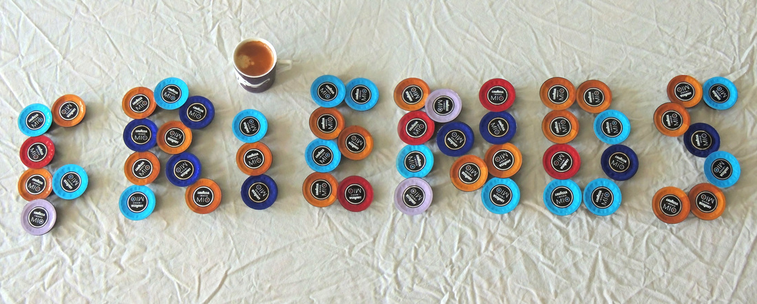
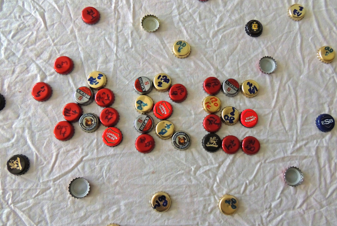
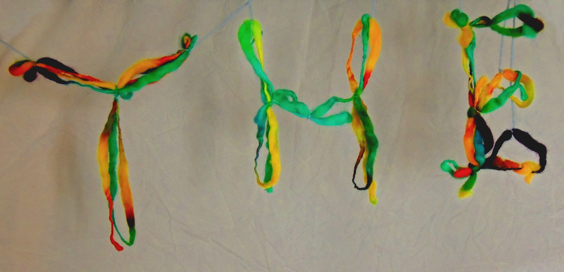
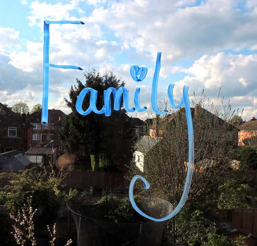
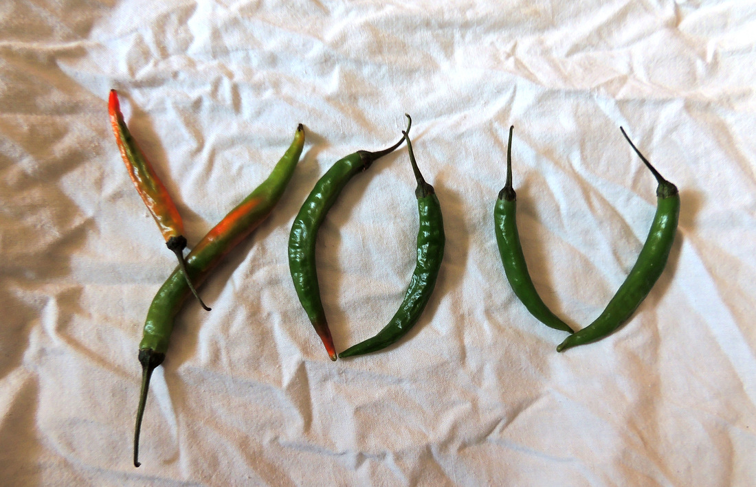
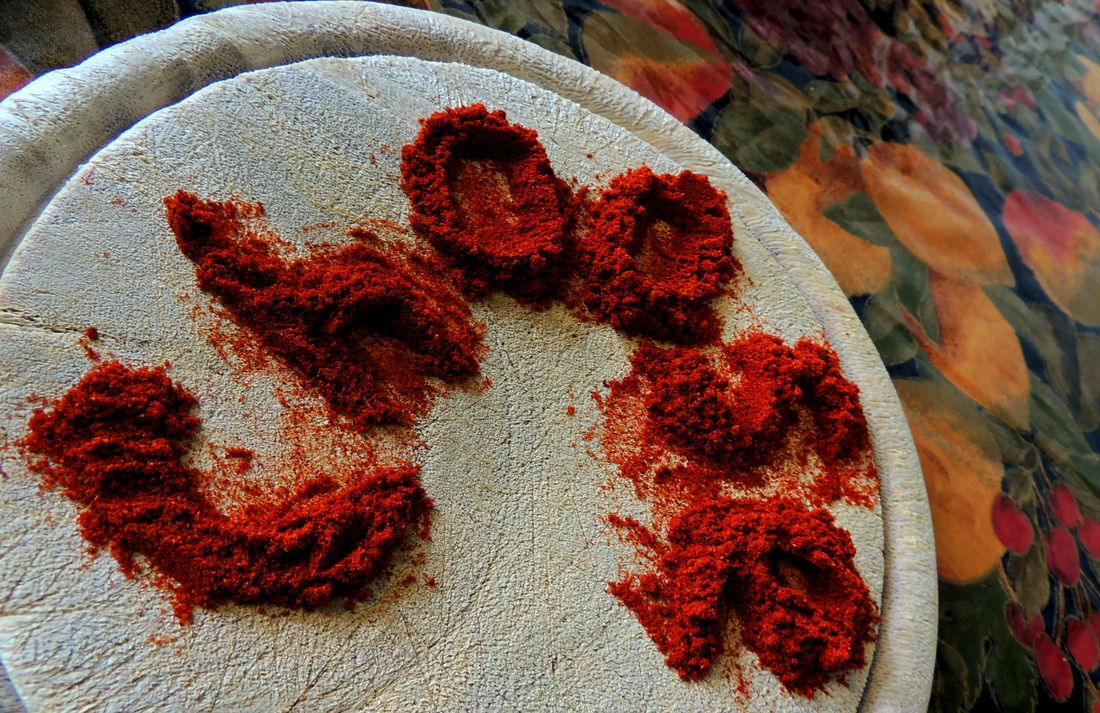
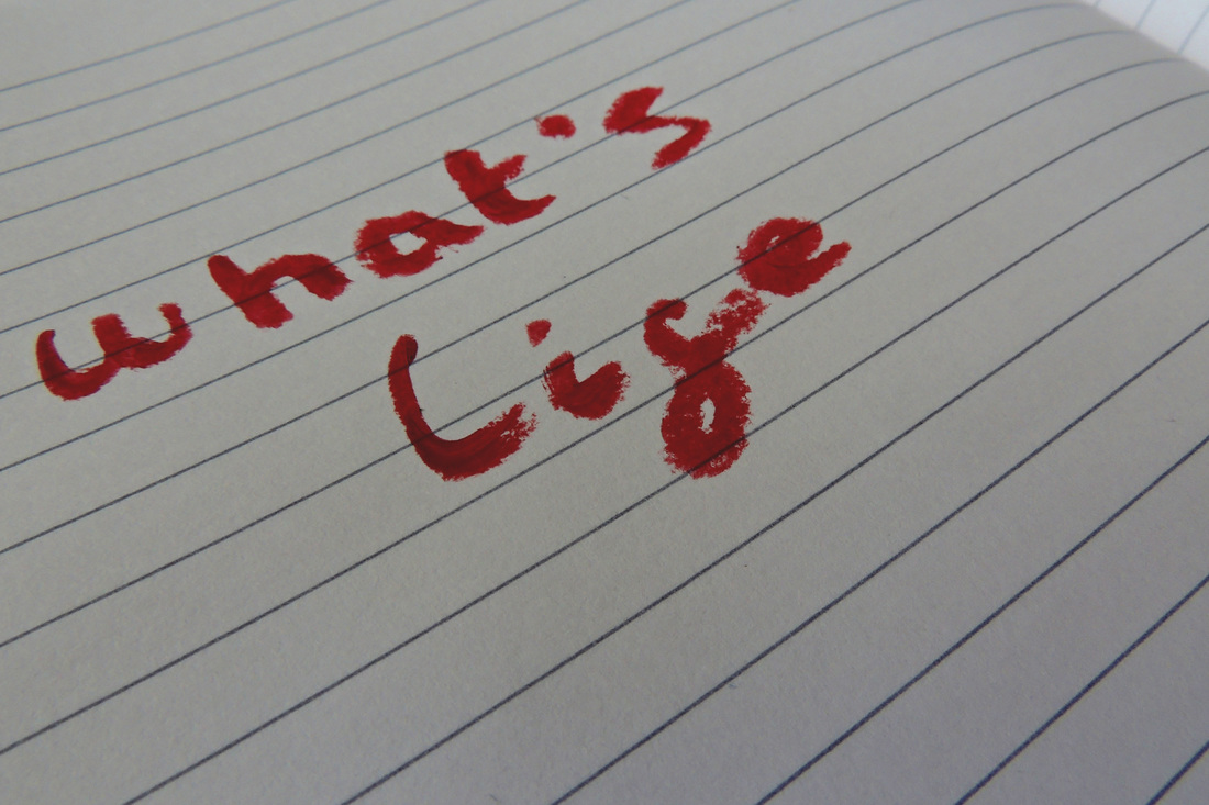
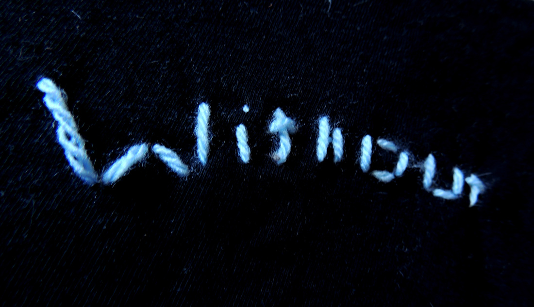
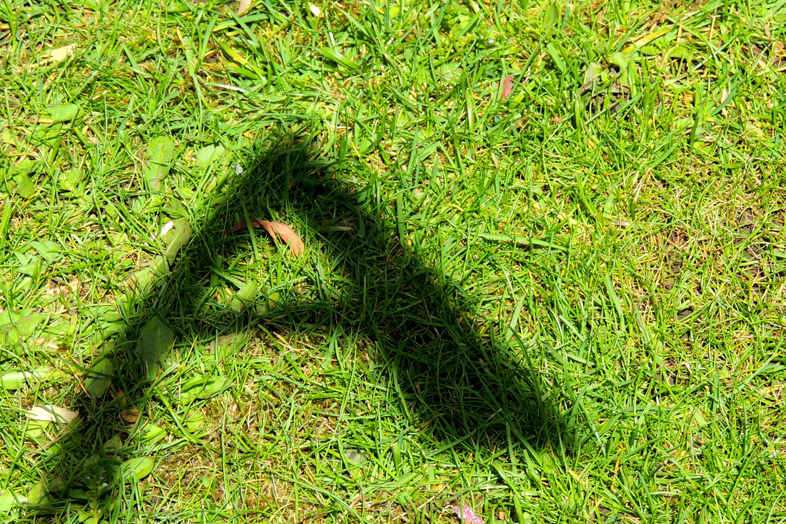
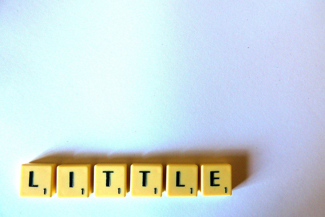
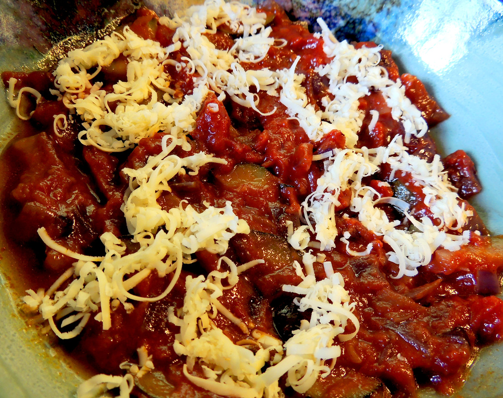
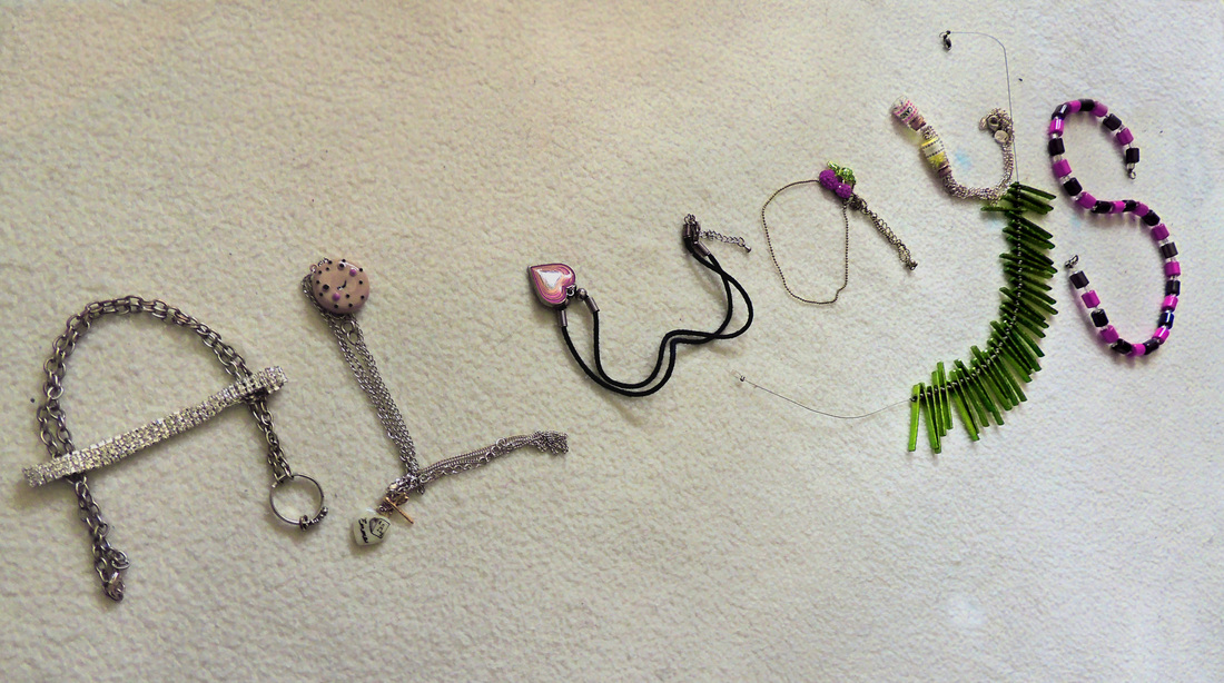
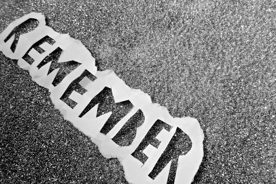

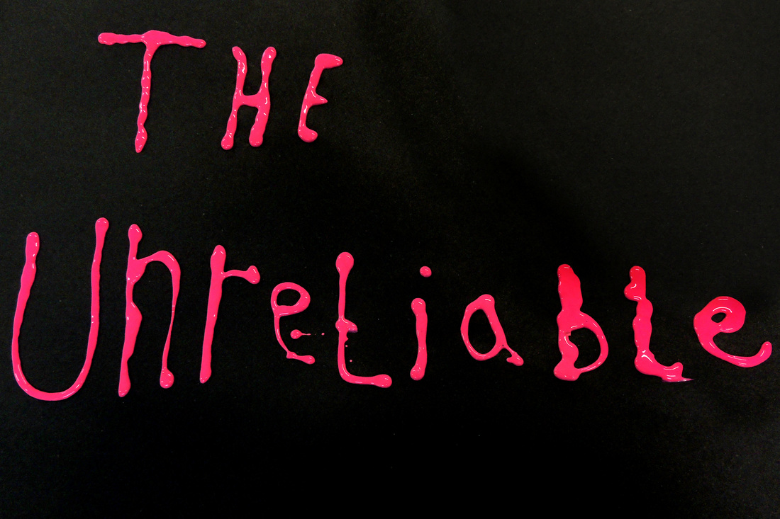
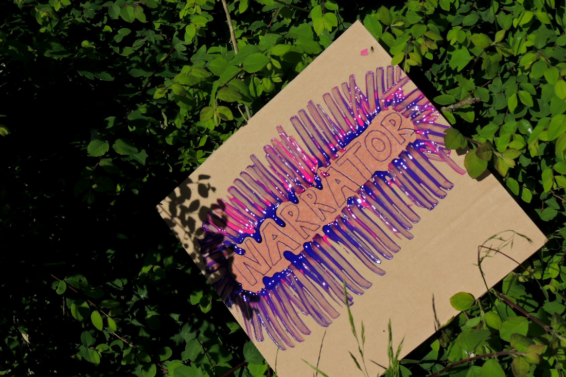
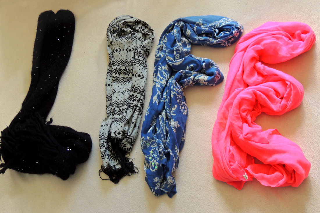
My typography artwork was inspired by Sagmeister's Things I have learned in my life so far, I used different techniques to spell out sentences which were things I thought were important messages in life. For the word 'friends' I used coffee pods for my coffee machine and made a cup of coffee for the dot on the 'i'. And suspended colourful wool from strings to make 'the'. For the word 'cheese' I used grated cheese to spell the word 'cheese' on some bolognaise sauce. 'Friends are the family you choose' is something that I think is important to remember, even if it is cheesy. So this was the inspiration for 'what's life without a little cheese?' because I think that the reason clichés like 'friends are the family you choose' are clichés is because they are true. The third sentence "Always remember, you are the unreliable narrator of your own life story" is about always questioning your judgement, just like in a book in which you have an unreliable narrator (such as in Harry Potter) you cannot always trust your judgement of situations to be acurate, and so it is important to question it.
I used typography because it allows you to explore identity through words and also to use lots of different techniques to create pictures which are interesting and engaging. It also allows you to expand the range of skills you use within photography.
I used typography because it allows you to explore identity through words and also to use lots of different techniques to create pictures which are interesting and engaging. It also allows you to expand the range of skills you use within photography.
